Iterative Design
My work
Explanation
In this example of the learning outcome, Iterative design, I will be showing the iterations on the project Fix UX. In this project, we had to choose a health insurance website and make an improved version of their website. The website we chose was CZ.
Action
Header
The first thing that I decided to change on the website was the header. The reason I chose to do this is because we noticed in our analysis that this was one of the pain points of this website.
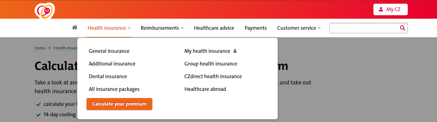
In the image above you can see the original header. Some of its pain points are that you can't switch between languages in the header, and you can't make the text bigger if you have trouble reading.

In the image above you can see the first version of the new header. The first thing I changed was that I added pictures so that it would be clearer and you could see faster what was what. The second thing I changed is the text size toggle, with this button you can change the text size, I found out, from research, that older people mostly prefer this element. Thirdly, I added the language toggle to the header instead of having it only in the footer, from our analysis we found out that English-speaking people struggled with finding the language switch, hence the relocation.

In the image above you can see the final version of the header. The key changes from the first to the last version include:
- Added "NL" to the language toggle for clarity and adjusted its text size to match "My CZ."
- Replaced detailed, mismatched icons with simpler, cohesive ones from a single icon set.
- Reintroduced the search bar and positioned it in the upper header for better separation from navigation elements.
- Added a magnifying glass icon to the search bar for clarity and improved intuitiveness, following design conventions.
- Increased white space around the magnifying glass and Dutch flag for a cleaner, more polished appearance.
Shopping basket
The first versions of the basket were not made by me but I made further iterations on it. In the image below you can see the first version of the basket that was not made by me.
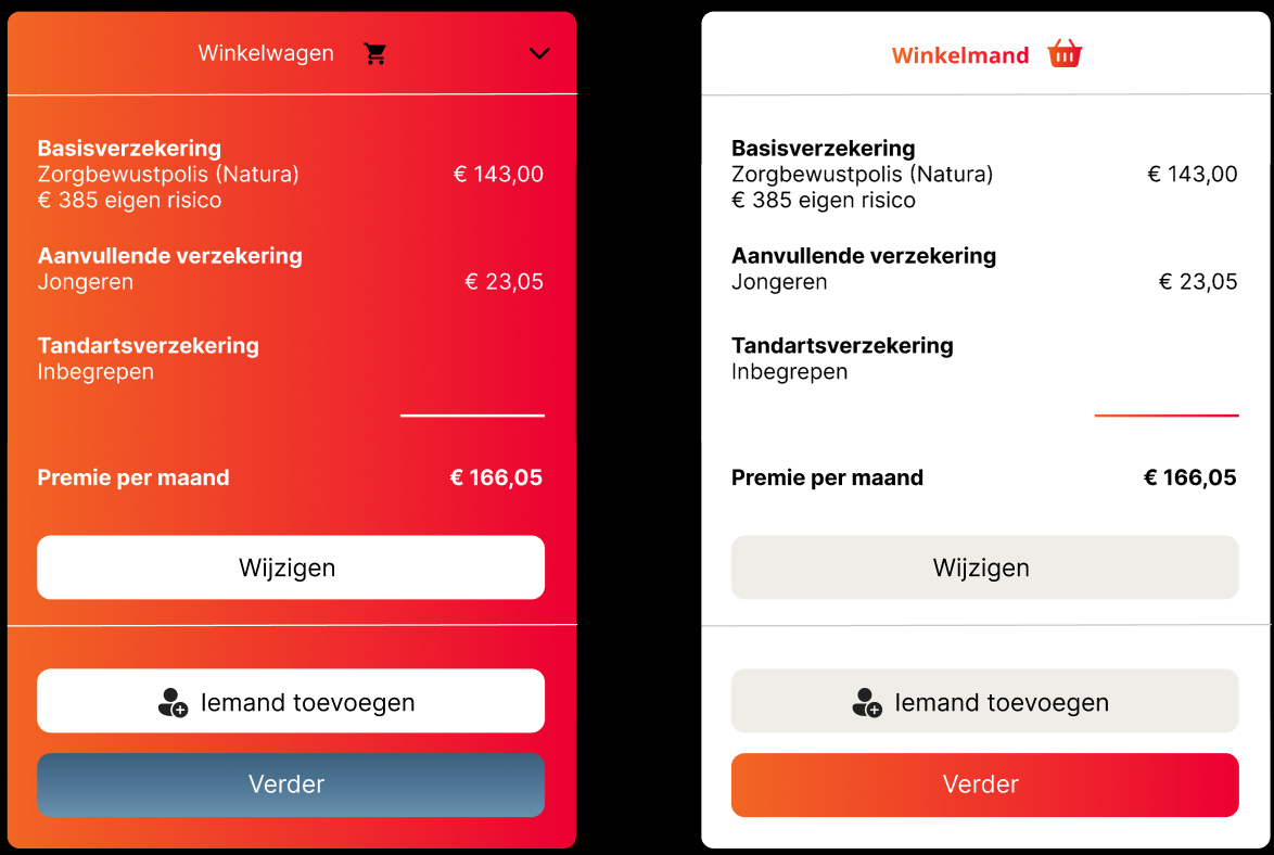
We received feedback on this version, stating that we should iterate more on it and that we should make it full width and I continued with that.
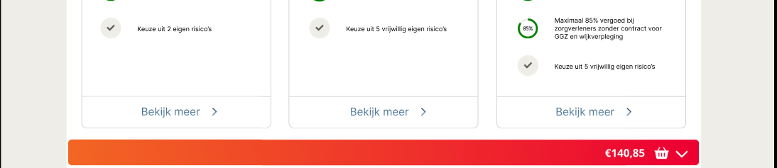
The pictures above show the iteration that resulted from that feedback. Then, I made some iterations on the extended basket to make it fit more into the rest of the website.
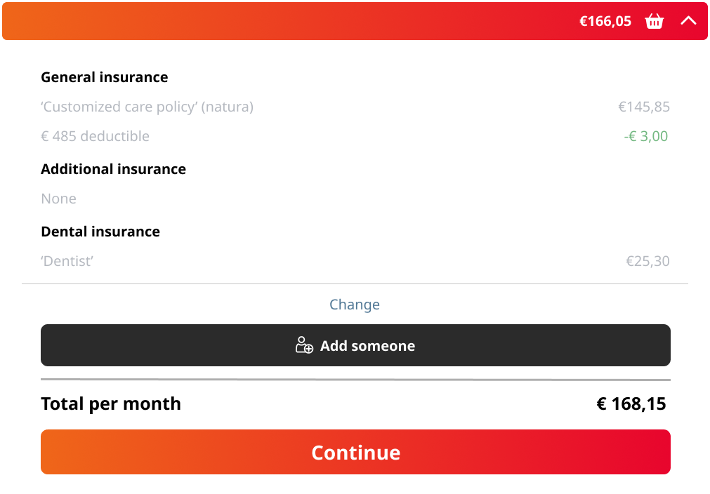
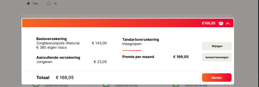
In the picture above you can see the final version of the basket. The key changes include:
- Adjusted the spacing between elements as a test.
- Updated the spacing to align with the rest of the website for consistency.
- Switched the positions of the "change" and "add someone" buttons for better flow, allowing users to modify their choices before adding someone else.
- Improved the visual balance by addressing cramped spacing between the black button and the "change" button line, making the layout appear more open.
- Moved the text on the right further right to align with the basket in the top red bar, ensuring better alignment.
After completing the prototype, my group and I couldn't conduct user testing. For the new development project, I performed user and AB tests to evaluate the previous prototype (user tests and AB test.docx). These tests revealed key issues, such as the red gradient links, which participants found less intuitive than the traditional blue.
In the second proof of the first learning outcome, you can see the specific points that needed to change and the changes that were made.
Finally, here is the link to the website my groupmate and I created for CZ.
Reflection
Reflecting on the iterations of the website CZ, I definitely feel like I should have done more user tests. This would have made the end product a lot more stable because right now it is partly what I thought was good instead of what the end-users would find good.
I do think I made some useful improvements from the original design like making the content quite a bit more centered. But, in the future, the only thing I would do differently is the amount of user testing.
See full documentation here: FULL DOCUMENTATION