Interactive Media Products
My work
Explanation
In this example of the learning outcome Interactive Media Products, I will be showing the prototype I made functional for the project, Fix UX. Additionally, I will be showing the user tests I did for this project.
Action
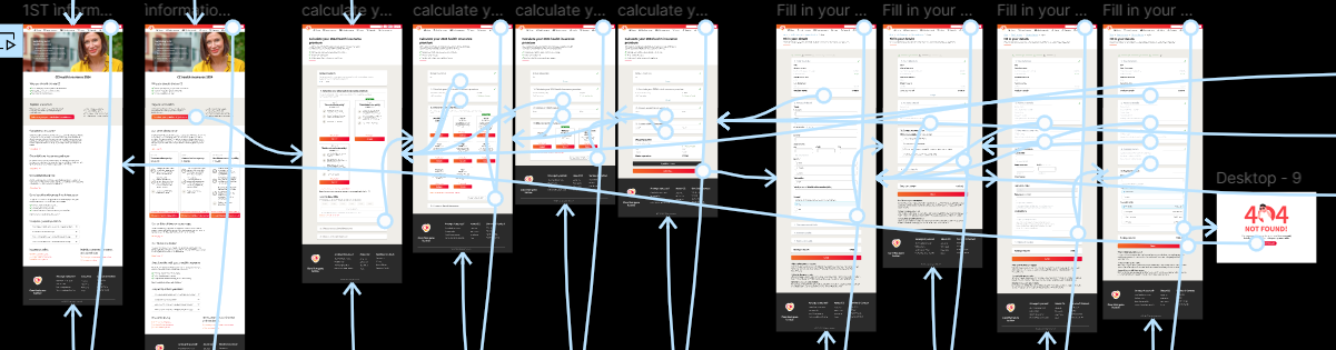
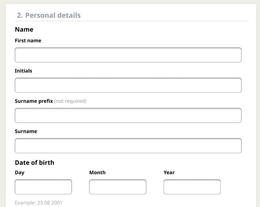
In the image above, you can see the interactions on the English version of the project. I did the interactions between the pages, not the interactions navigating to the Dutch version.
Here is the link to the entire prototype.
After making this prototype, I tested it with users.
From these tests, I gathered that the new design wasn't as good as I thought. These were the main pain points and it is what will be improved on in the new prototype.
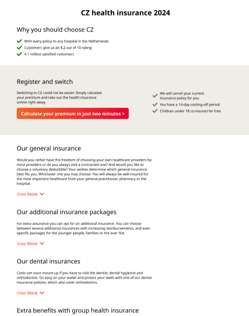
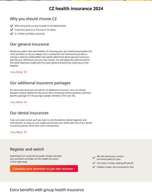
- The 'register and switch' section will be relocated because I got the feedback that it was more logical to first learn about the packages and then switch.
- Making links to external pages blue, because I received the feedback that this was more intuitive.
- Making the progress bar on the fill-in-your-details page the full width of the section and brighter because we received feedback that the old version of the progress bar was better and the better elements were that it stretched over the full with and that it was brighter.
- On the fill-in-your-details page, left align the elements so you can read in one row. I will do this because it was one of the feedback points I got.
After processing these tests I made a new design.
In this prototype, I implemented all the changes based on the summarized user test feedback. These modifications were made to better align with user needs, improve usability, and enhance overall satisfaction. Below you can see the before and after versions of the prototype.
Before and After (register-and-switch relocation):
Before and After (making links blue):
Before and After (changing progress bar):
Before and After (aligning elements):
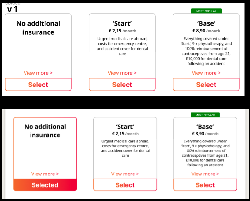
I also made a few different versions of the selections on the Calculate Your Premium page.
We decided to go with the first version because this version emphasized the selected option. We did not have time to further user-test this element.
Finally, for the interactive side of the project here is the link to the website.
Reflection
Reflecting on the first part of the learning outcome, orienting on relevant tech, I feel like I could have learned more about Figma. This would have made the prototype more interactive and therefore better.
Reflecting on the second part of the learning outcome related to user testing, I realize that I fell short in this area. This was primarily due to my inefficient project planning. I spent too much time focusing on research instead of conducting user tests on our designs, which ultimately led to a time constraint. Although I did seek feedback from the teacher, it wasn't enough. Even though I managed to conduct user tests later in the project, they should have been performed during the first phase of the Fix UX project.
In the future, I will keep trying to focus more on user testing because this is an important part of the design process. Improving my Figma skills is not so high on my to-do list but along the way, I will also try to improve in that field.
See full documentation here: FULL DOCUMENTATION