Iterative Design
My work
Explanation
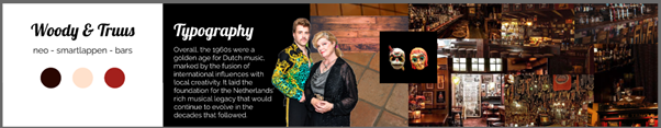
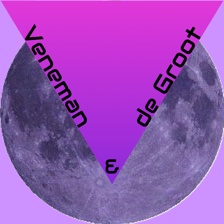
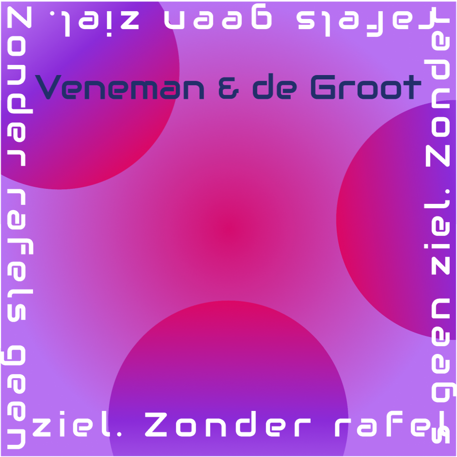
In this example of iterative design, I will be explaining my iterative process of the first group project. The first project is about branding for a musician pair. I was mainly 'in charge' of creating the logo.
Action
I first started by gathering some inspiration. Moodboard.pdf.
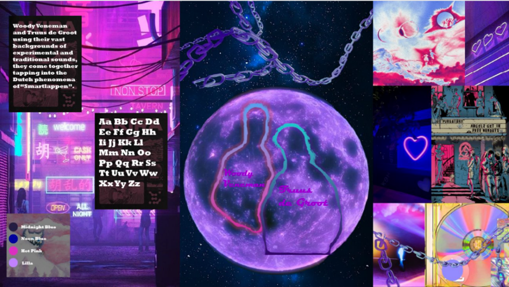
I chose fonts and colors, created five mood boards on Pinterest, and began a style scape in Figma with color samples.
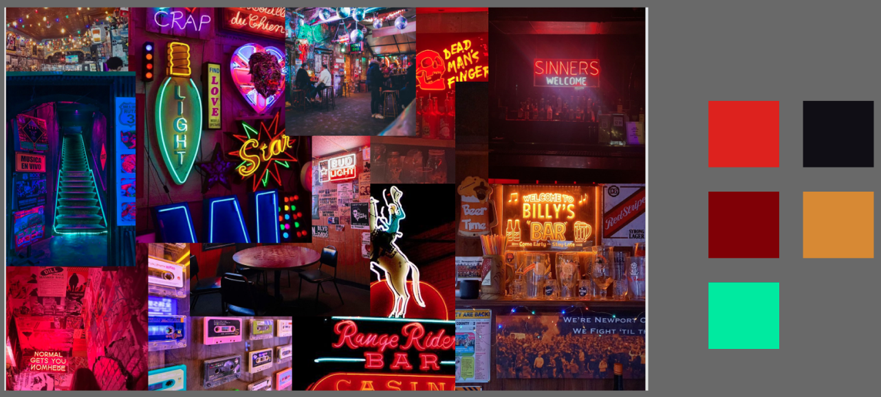
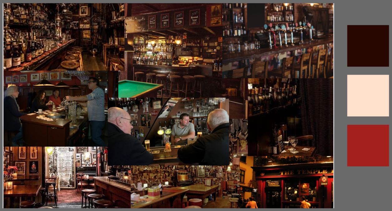
In the images below you can see two mood board tests I made with some colors on the side. In the end, I went with the second mood board and I chose the font 'Lobster' to continue with.
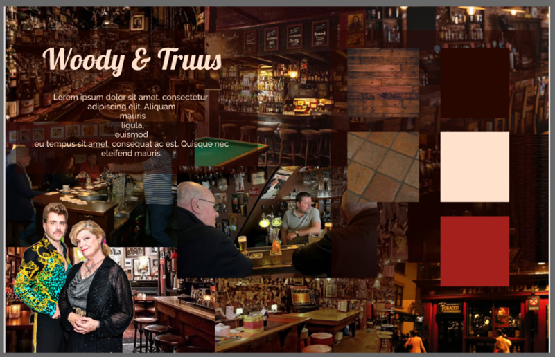
In the picture below you can see the first style scape I created.
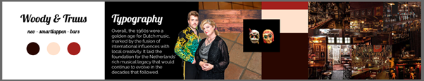
I showed my stylescape to the teacher, and the feedback was that it looked cluttered and unclear. The background images distracted from the colors, textures, and fonts. In the images below you can see the improved version and then the final version of the style scape I made. In the final version, I got rid of the repeated display of colors.
After making this final style scape I started working on making the logo. I first made some sketches.
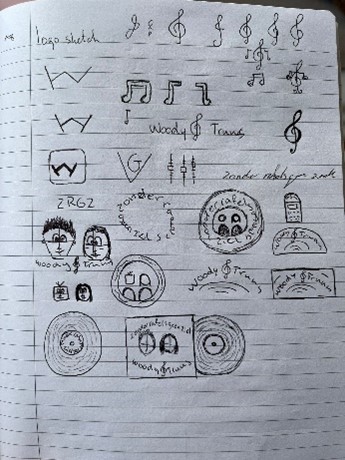
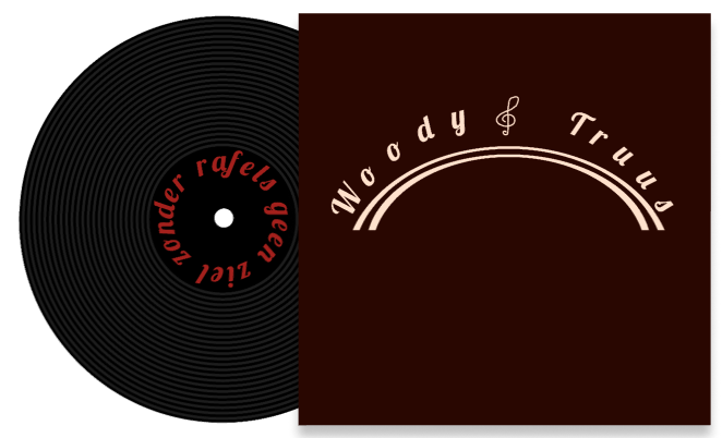
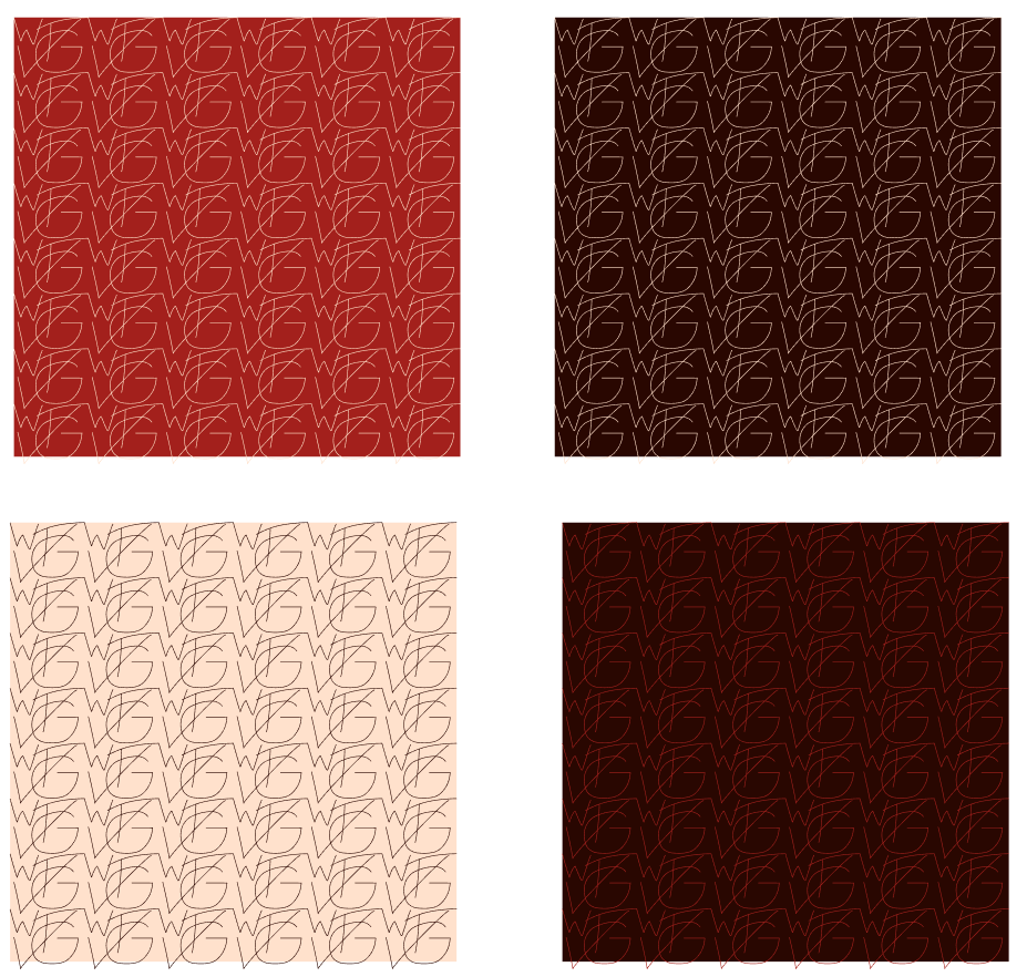
Then I went to Figma, and I started trying things out. In the images below you can see the arched versions I made.
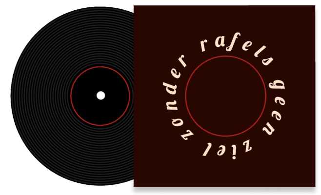
Then I decided to make some vinyl-inspired logos.
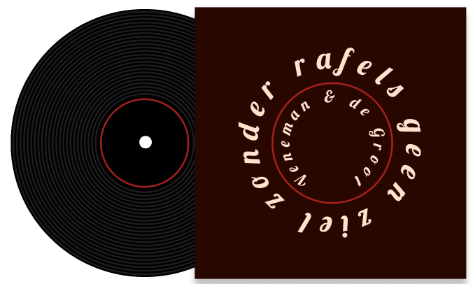
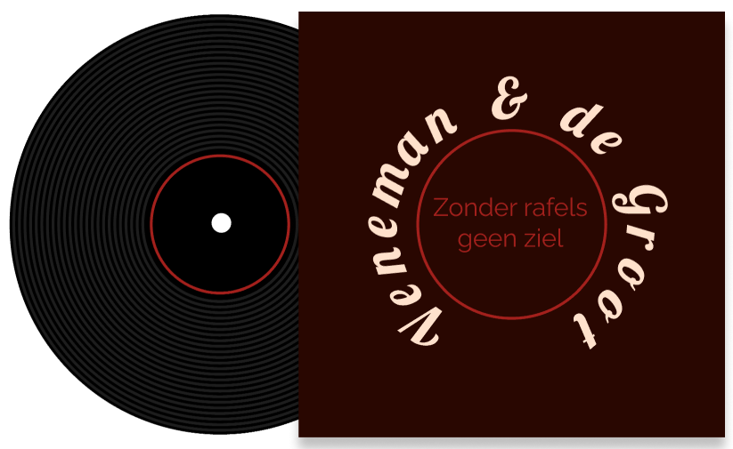
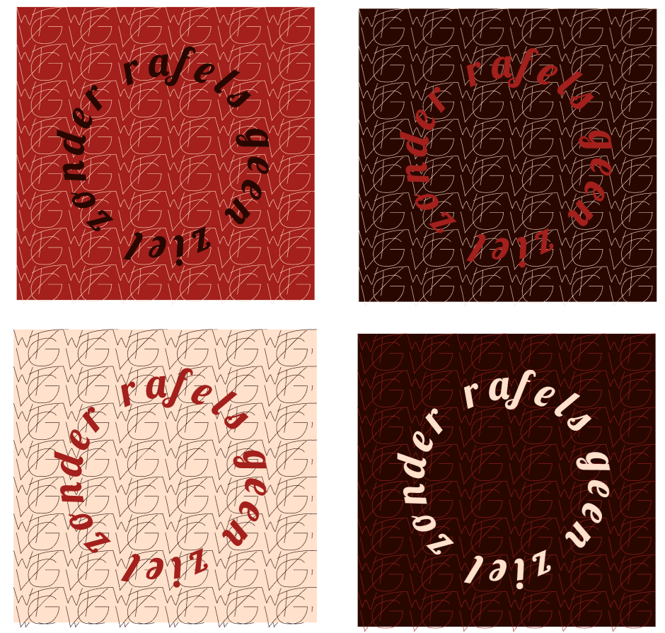
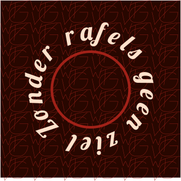
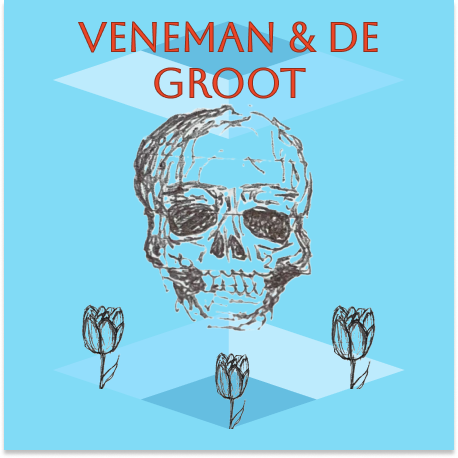
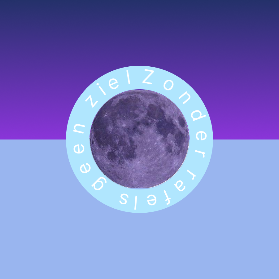
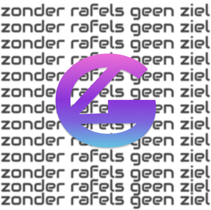
Finally, after testing out a bunch of things I came to a final version. See image below.
I showed these logos to the client and received feedback that this wasn't liked.
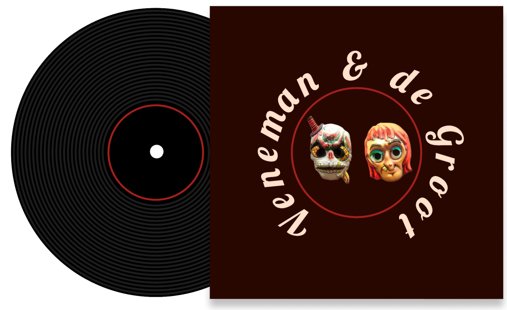
My project group also presented another bundle of style scapes and logos to the client. He preferred those more, a modern vibe with elements like skulls, flowers, and neon colors, rather than the bar theme. A group member created a new stylescape based on this feedback.
The feedback showed we were on the right track; he liked the image randomness but not the font. Logos should be eye-catching and informative. A survey I created helped refine our direction.
The survey showed that the target audience found the colors happy and futuristic, which supports our goal of revitalizing Smartlappen's branding. The mixed feedback on whether the colors were futuristic or retro benefits us, given Smartlappen's history. After this, I created sketches and returned to Figma.
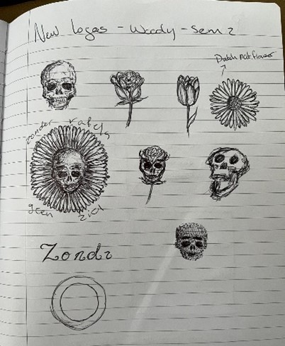
Because the client said he liked skulls and flowers I sketched a skulls and flowers. I exported these images to Figma and just started trying things out.
I experimented with colors and fonts but found them unoriginal, so I researched better options.
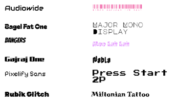
I chose these fonts because they felt most fitting to the style scape/the concept. With these newfound fonts, I started creating some more logos.
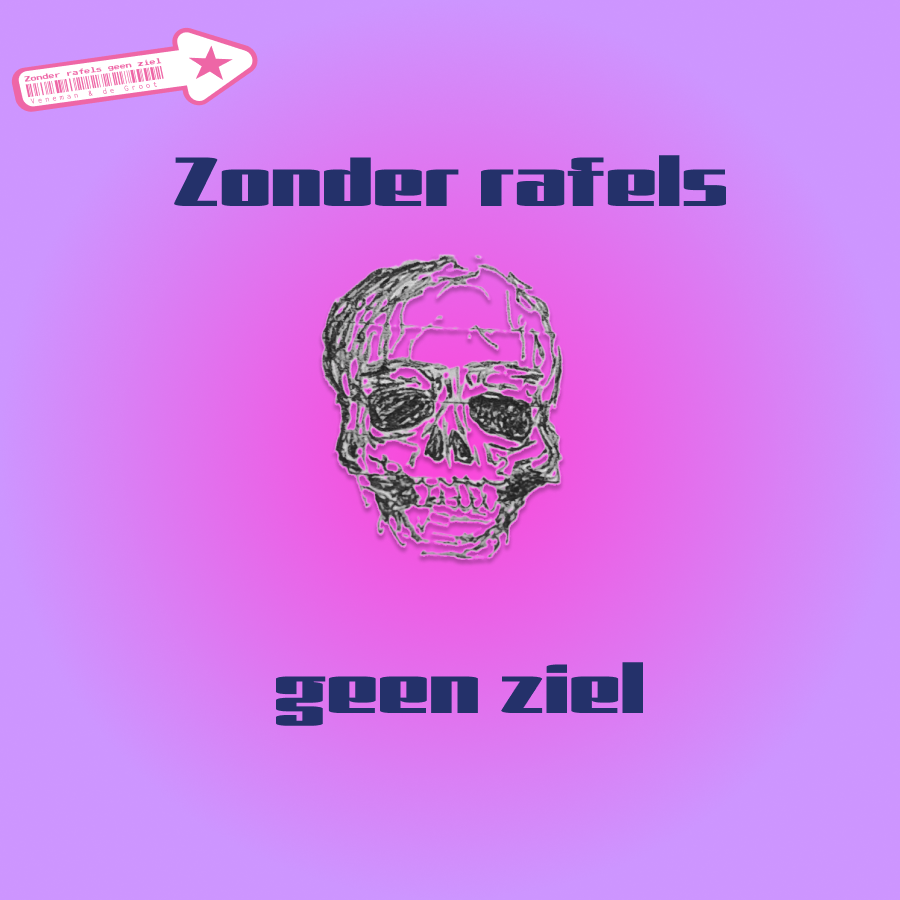
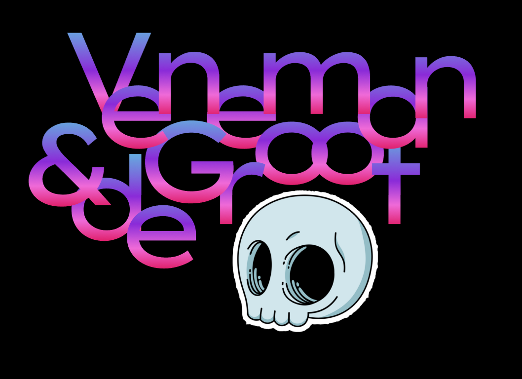
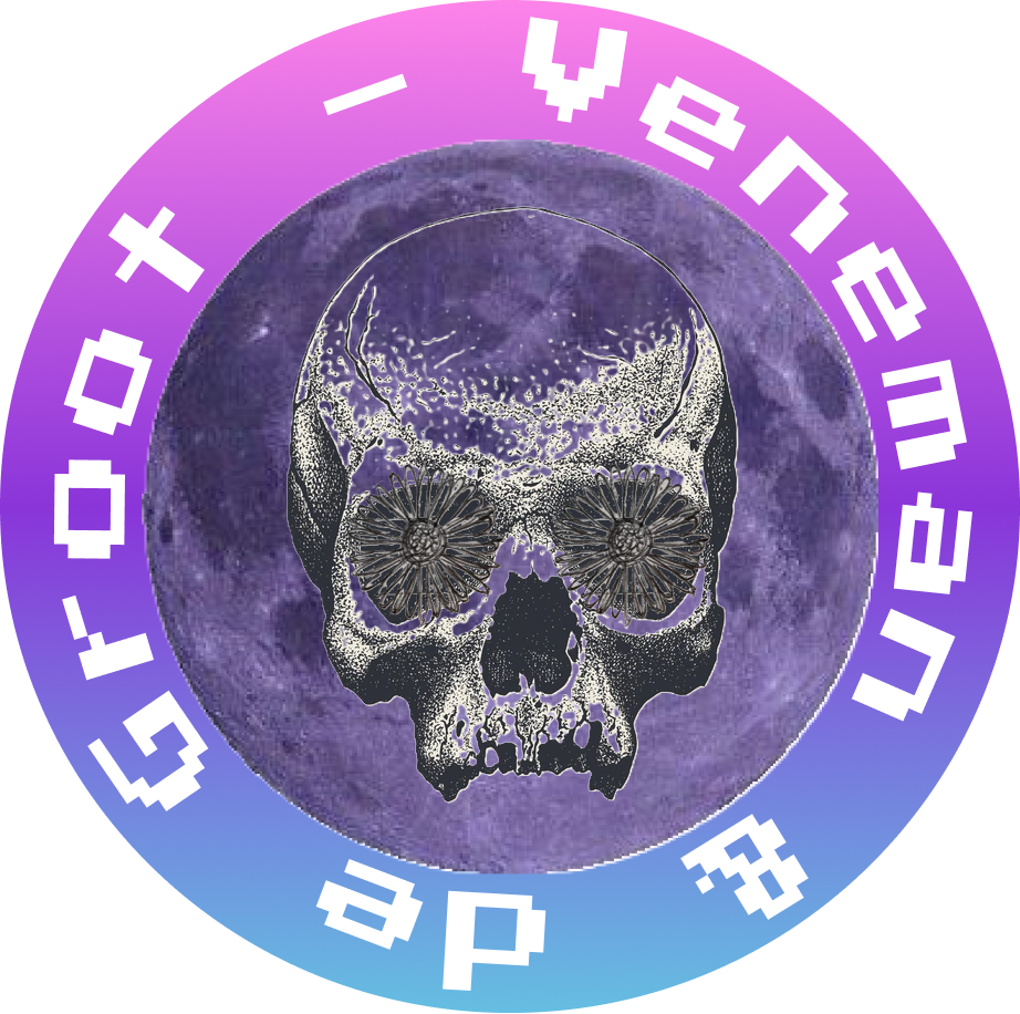
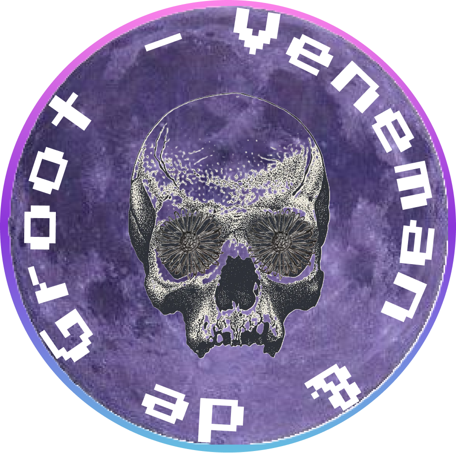
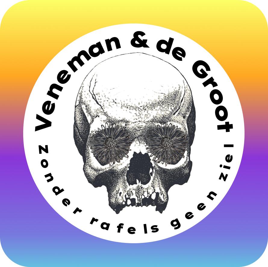
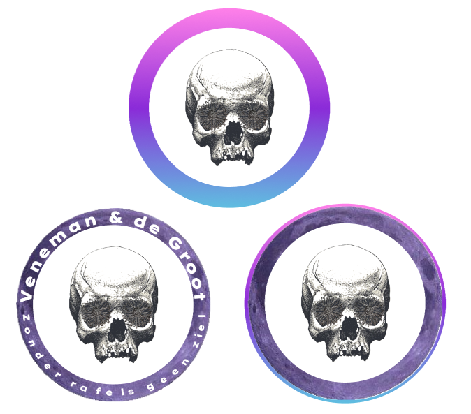
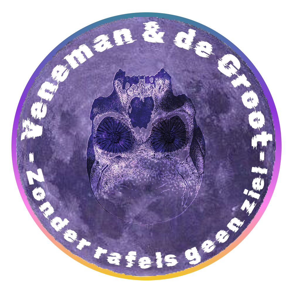
After testing out a bunch of variations I focused more on the skull that the client previously liked.
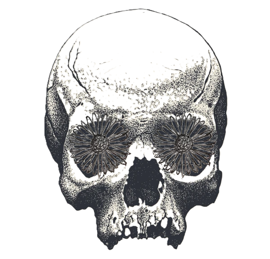
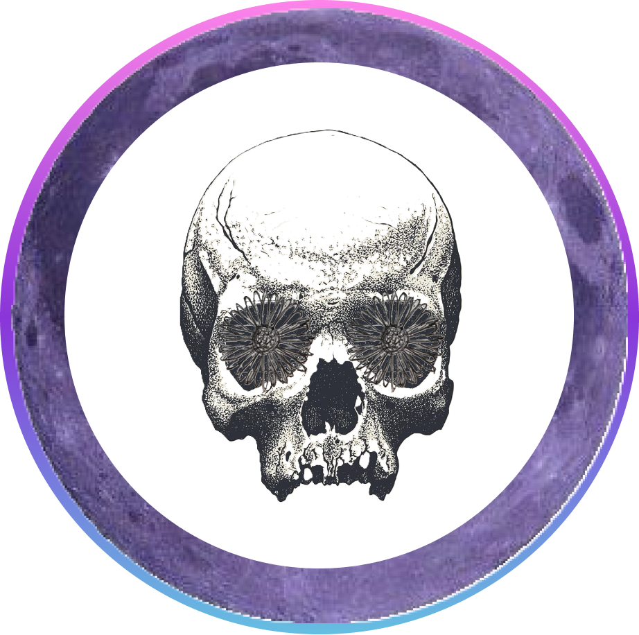
I remembered the client liked grainy images, so I picked a skull and drew different flowers in its eyes. After looking at all of them I picked the first one, the one with the daisies. Daisies are also the Dutch national flower, therefore fitting with the Dutch genre of music. Here are some of the first versions I came up with.
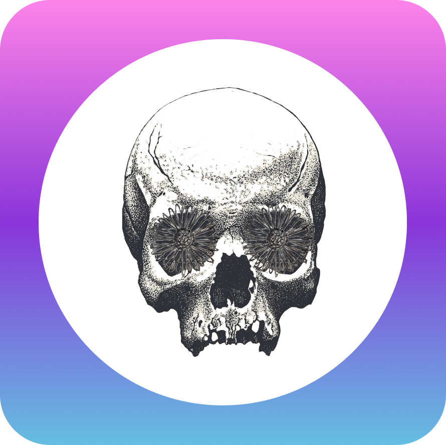
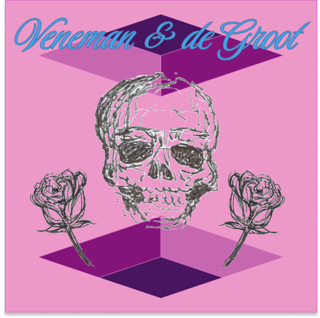
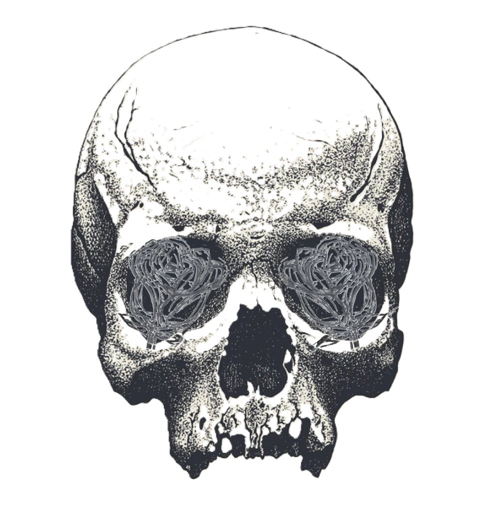
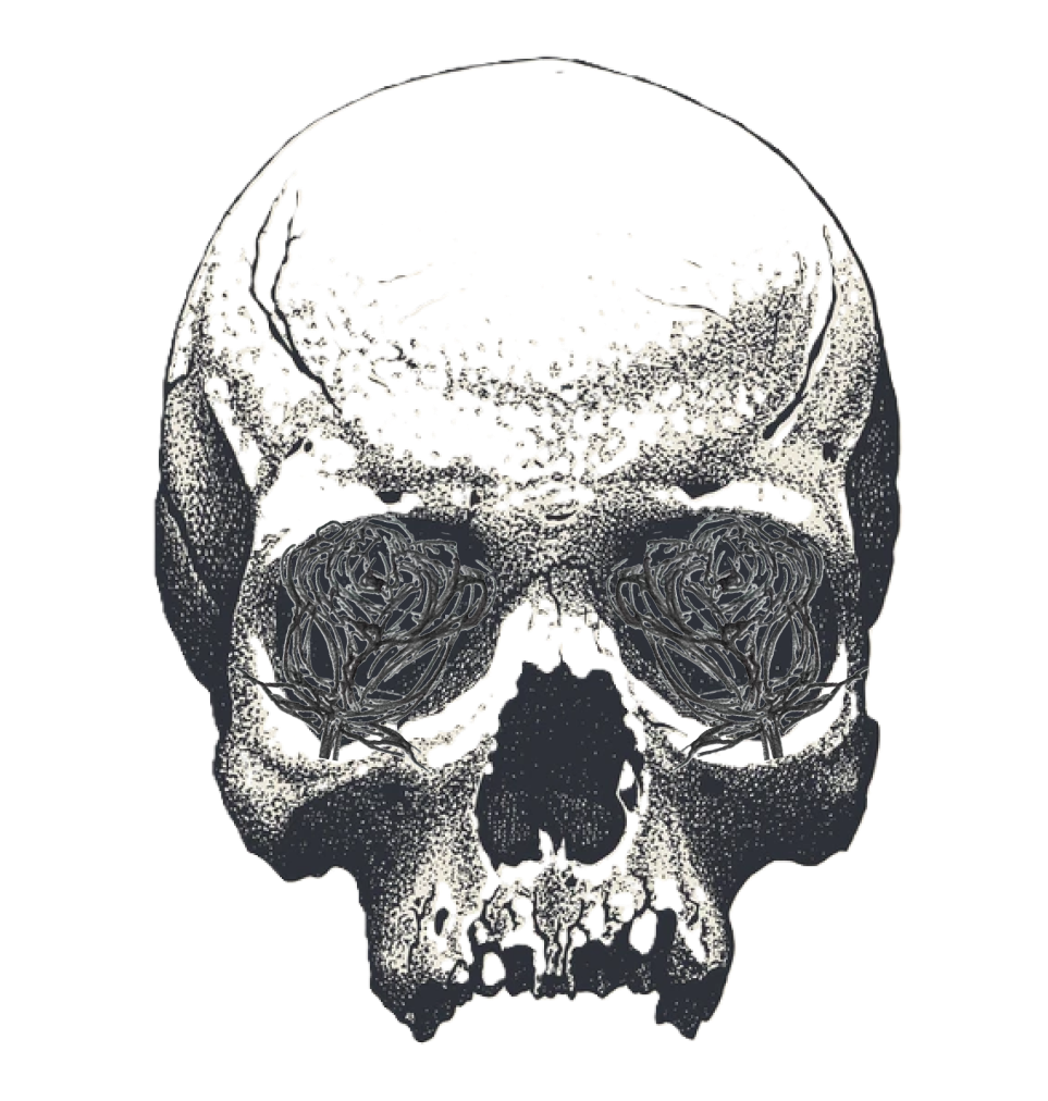
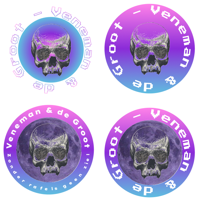
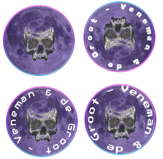
I expanded on each version, trying different fonts and changing the compositions slightly.
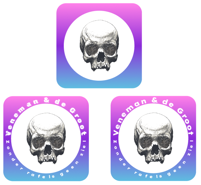
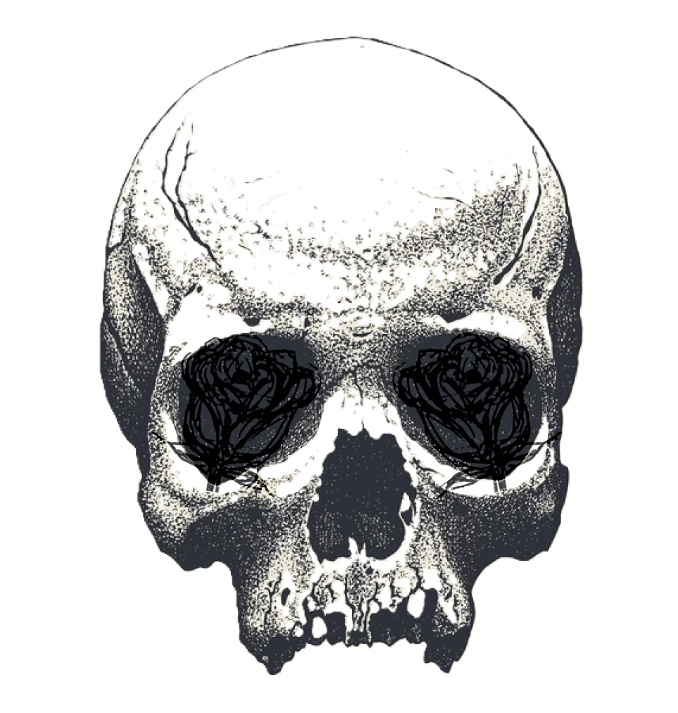
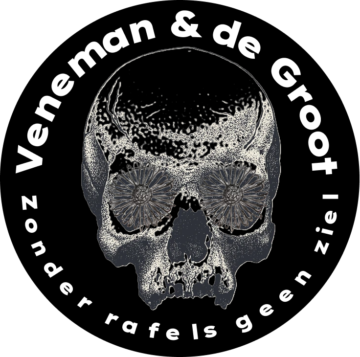
I also created some 2D versions. After more testing and iterating we settled on the next two logos.
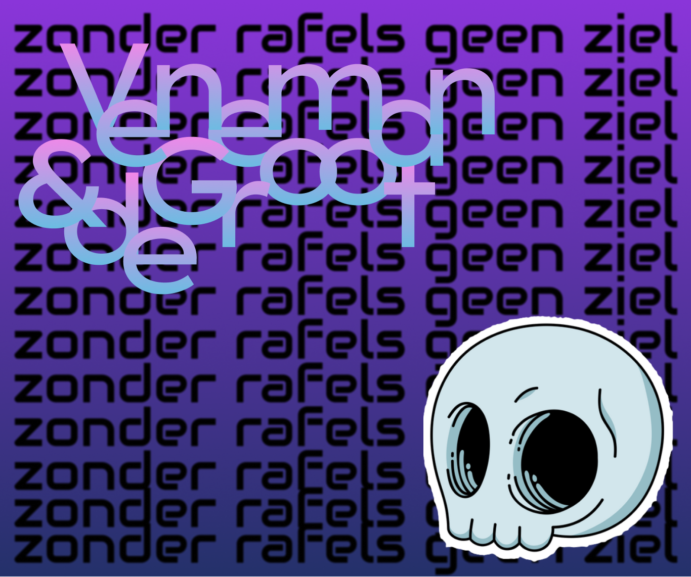
I also made some posters.
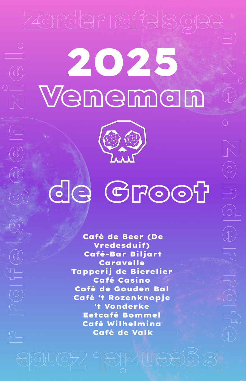
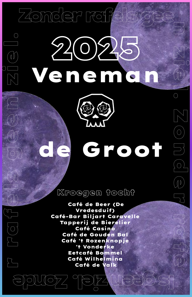
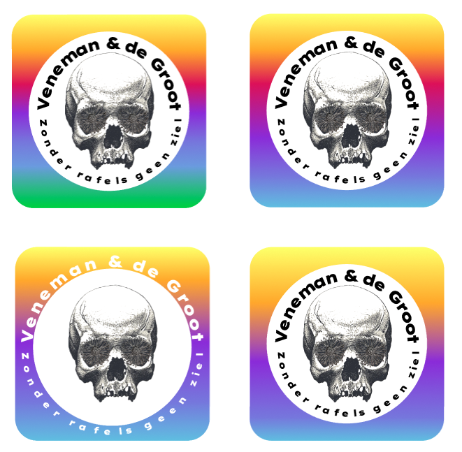
The client was unhappy with the initial designs, finding the font not "special" enough and the skull too plain. However, he preferred an older logo with a different font, which we ultimately chose. Survey feedback showed a strong preference for "detailed, story-driven artwork," which inspired the cohesive and detailed approach to the logo and overall visuals.
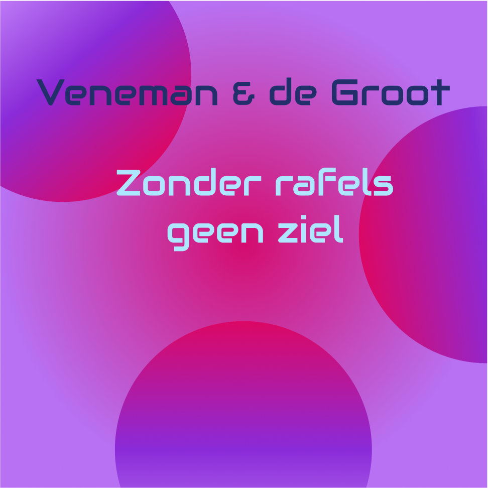
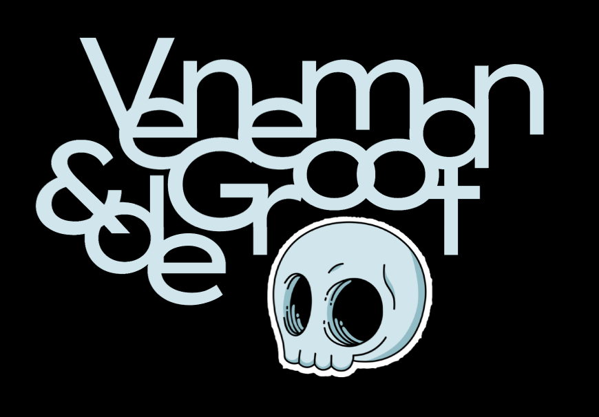
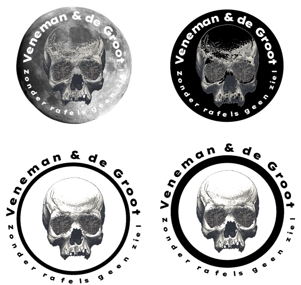
After playing around with the old logo a bit more we settled on our final logos.

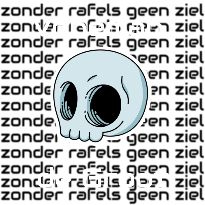
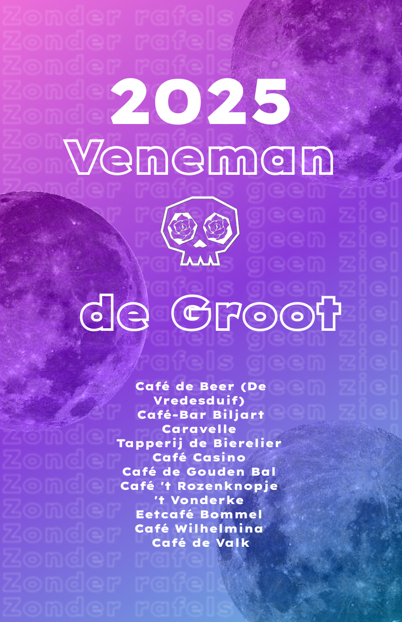
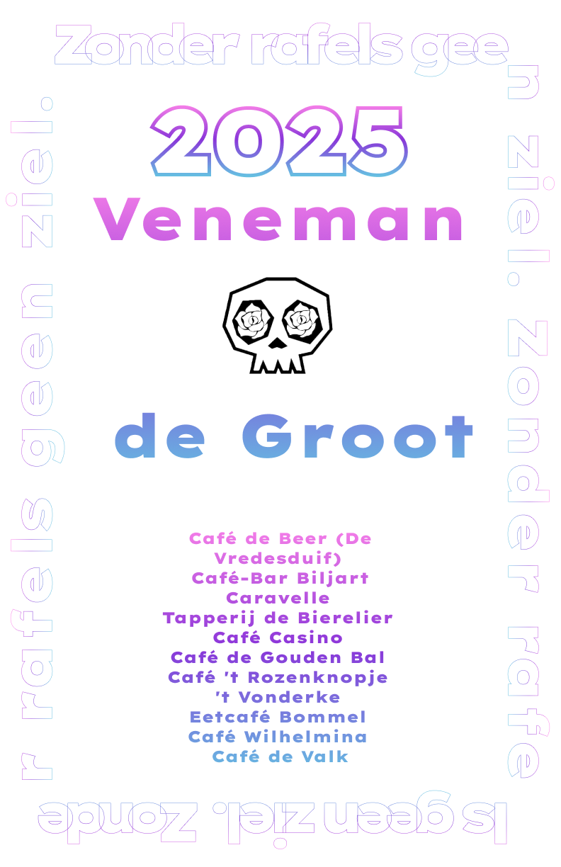
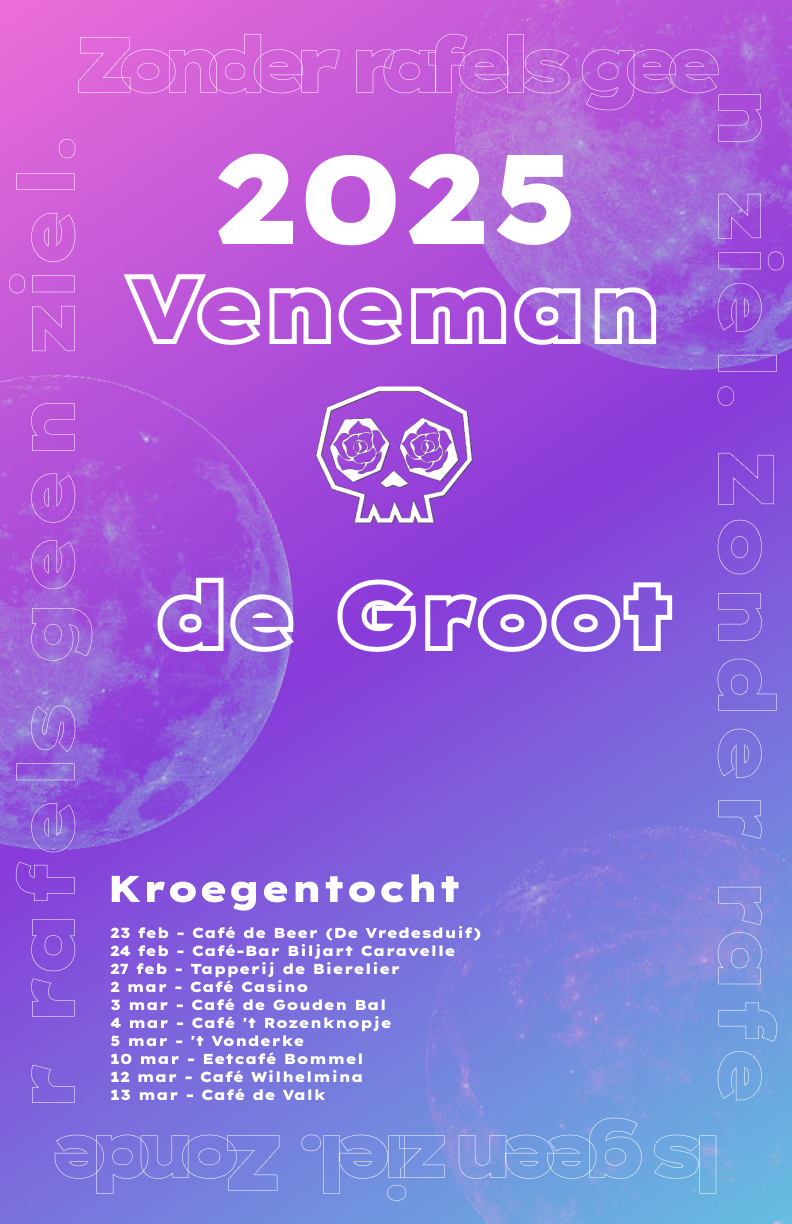
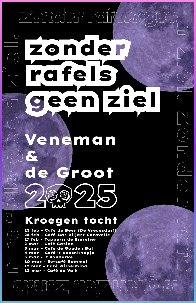
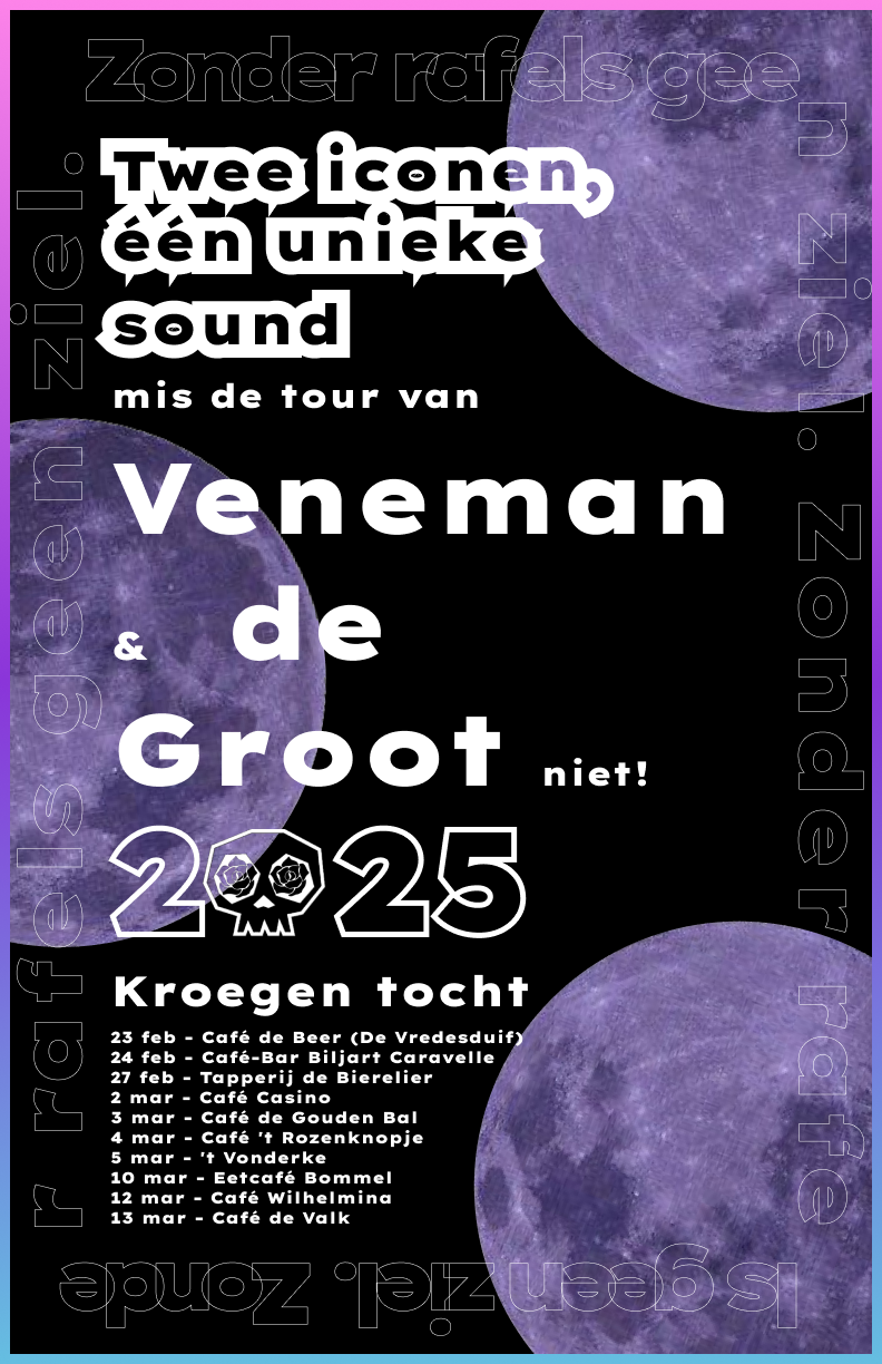
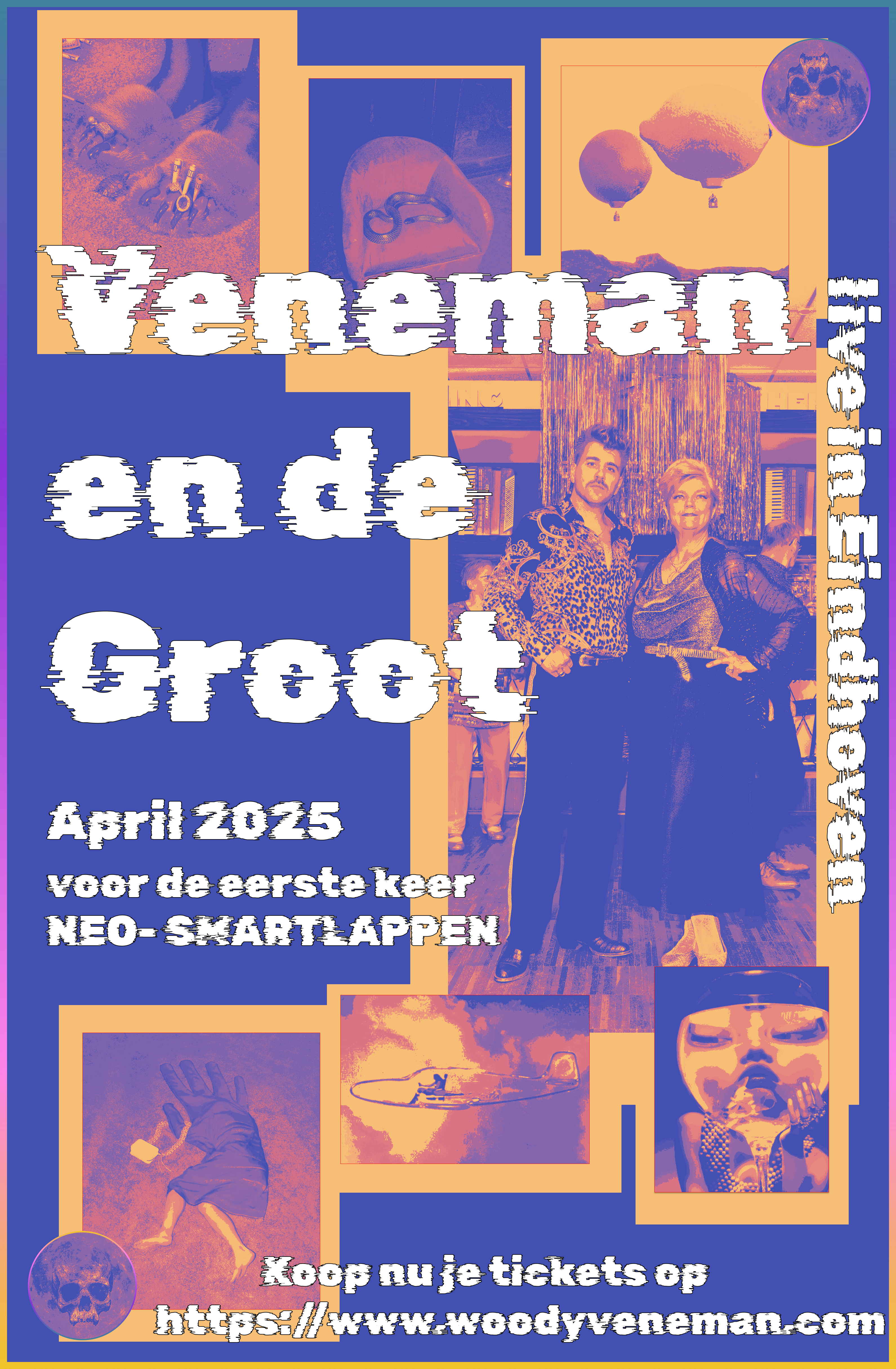
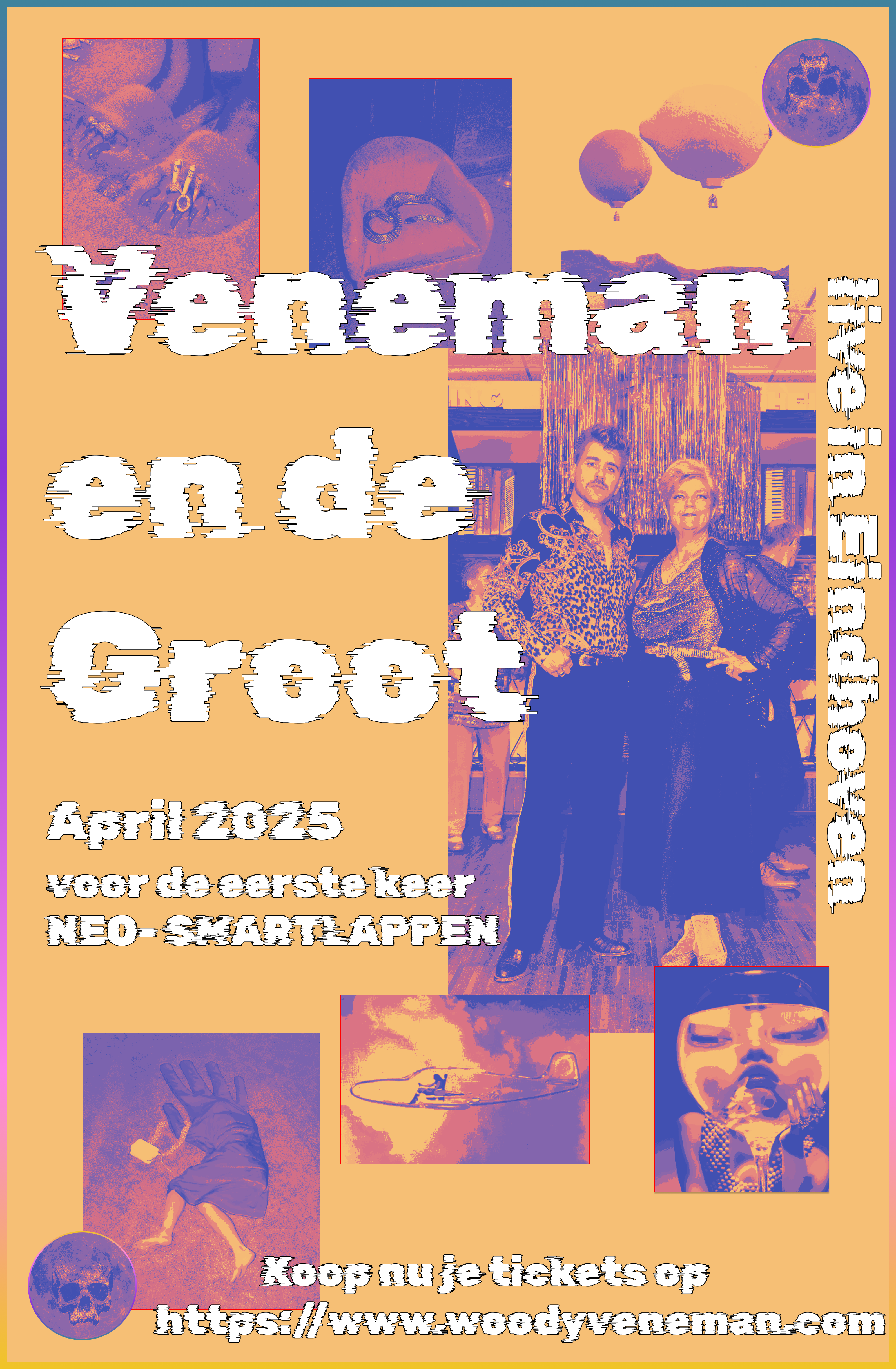
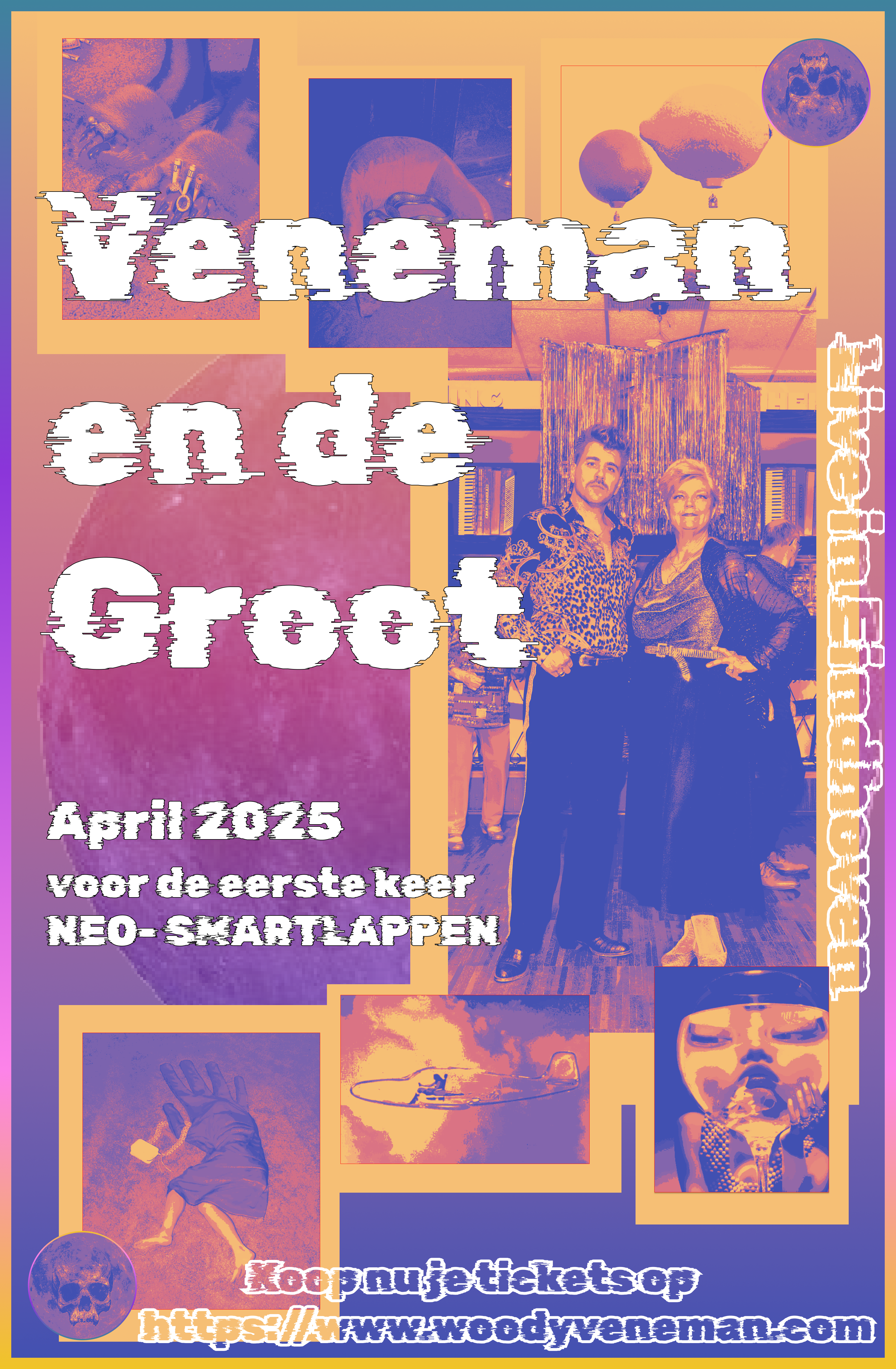
For the poster, I created some iterations on a version created by my groupmate. This was the initial design.
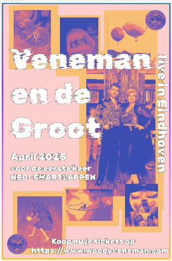
And these were the iterations I made on it. The last poster is the one we decided to use.
Reflection
Reflecting on this entire process, I put a lot of effort into creating a product, specifically the logo, that would appeal to the target audience and the client but in the end, I had to settle on something that I wasn't entirely pleased with.
At the start of the project, I was unsure of how to proceed. Now that the iterative process is complete, I believe that the main area where I fell short was not seeking enough feedback on my designs from both the teachers and the target audience. This would have ensured that I was creating what was actually needed. In the future, I intend to ask for more feedback.
Additionally, I will make sure to have a clearer understanding of the client's requirements so that I don't have to start from scratch after investing time in creating something that is not desired. I plan to achieve this by having an early meeting with the client or by thoroughly understanding their initial requirements.
Overall, I think this project could have gone better, but I learned from it.
See full documentation here: FULL DOCUMENTATION