Iterative Design
My work
Explanation
In this example of the learning outcome of Iterative design, I will be showing the iterations of my portfolio.
Action
When we were told to create a portfolio like in semester 1, I quickly chose a theme: wizards. I searched for images on Pinterest and created a mood board.
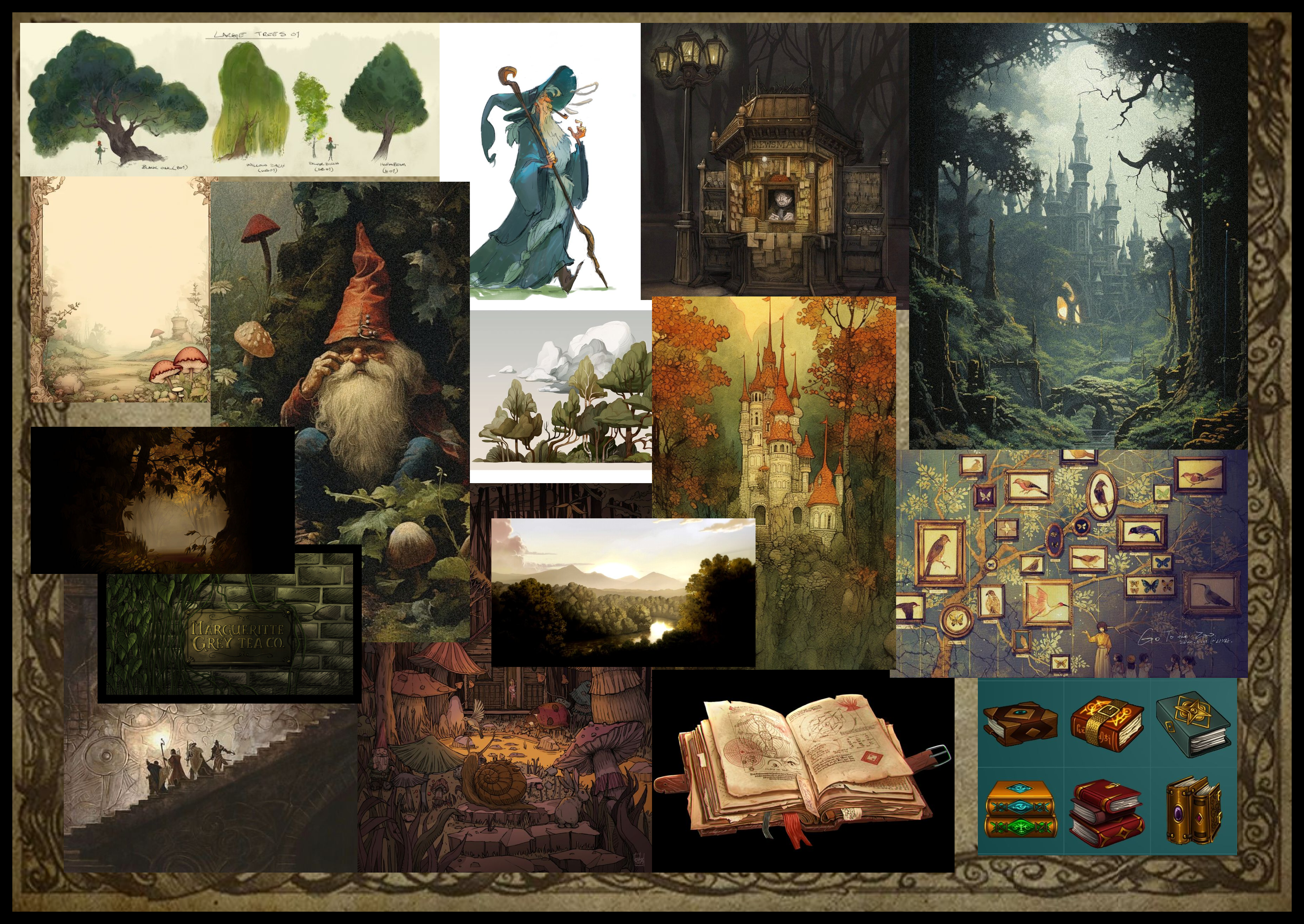
This refined mood board draws inspiration from my 150-pin Pinterest collection. I chose this theme after revisiting Lord of the Rings and Harry Potter and enjoying exaggerated wizard memes, which I found hilarious. This theme offers rich creative potential, and in semester 2, I can explore unconventional, playful aesthetics without prioritizing professionalism.
After creating a mood board, I went and made some sketches.
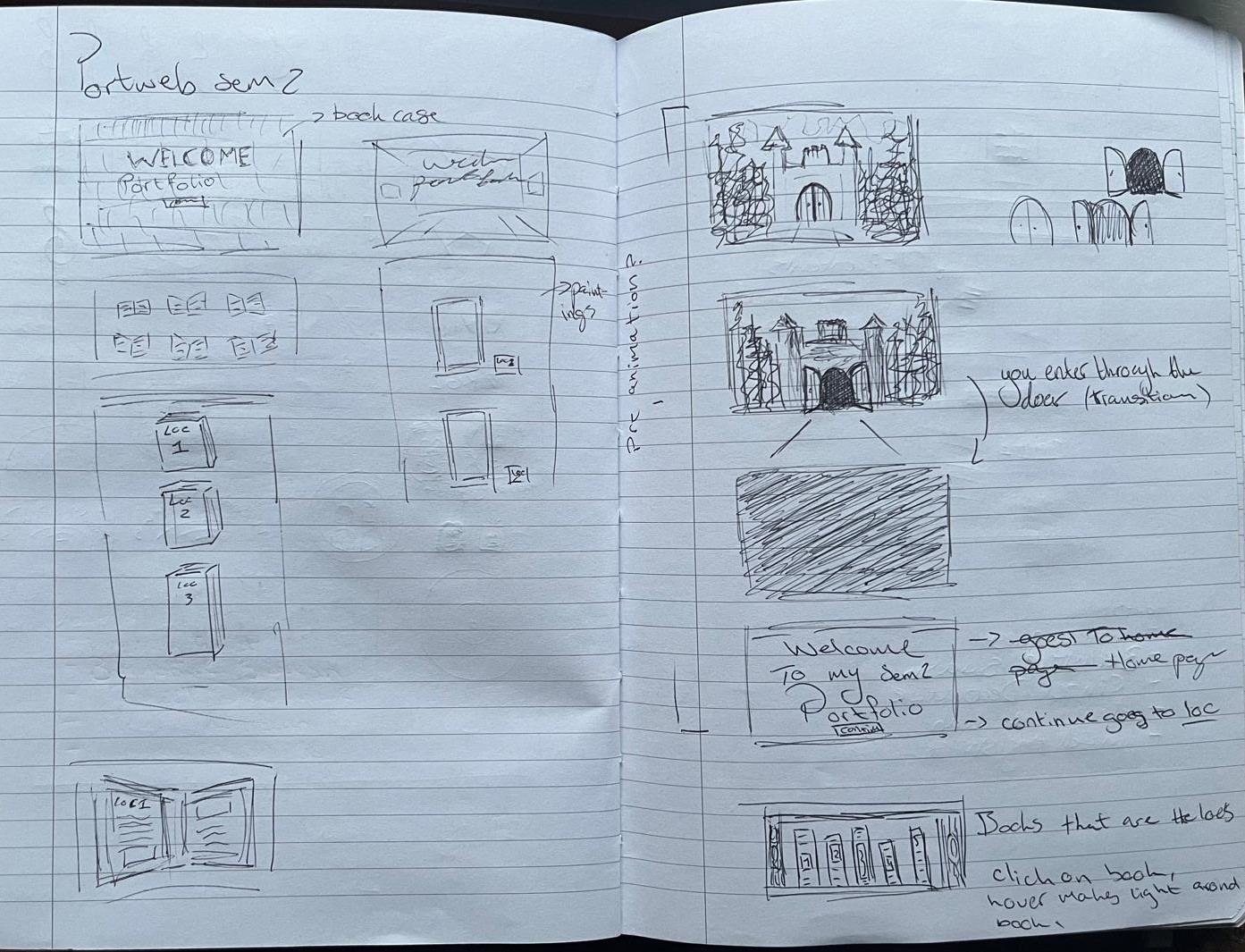
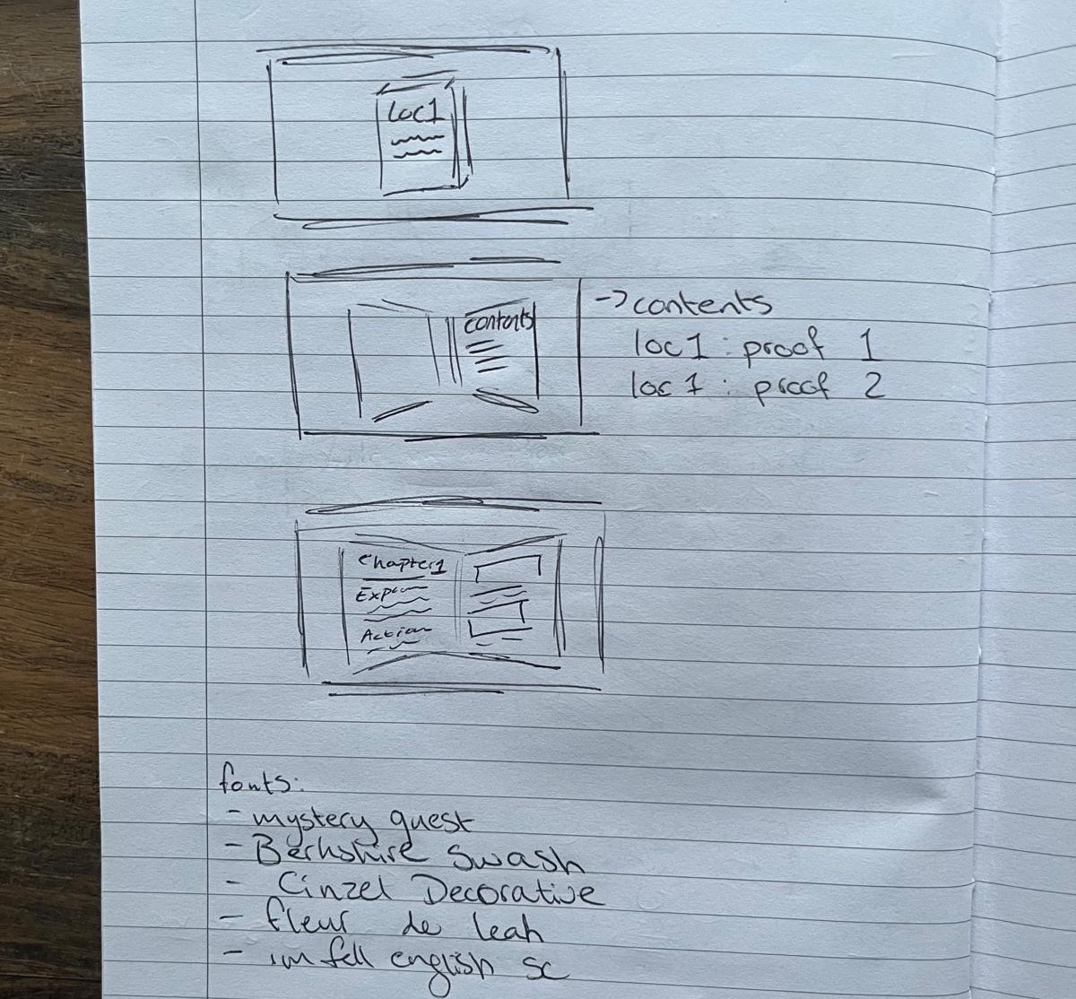
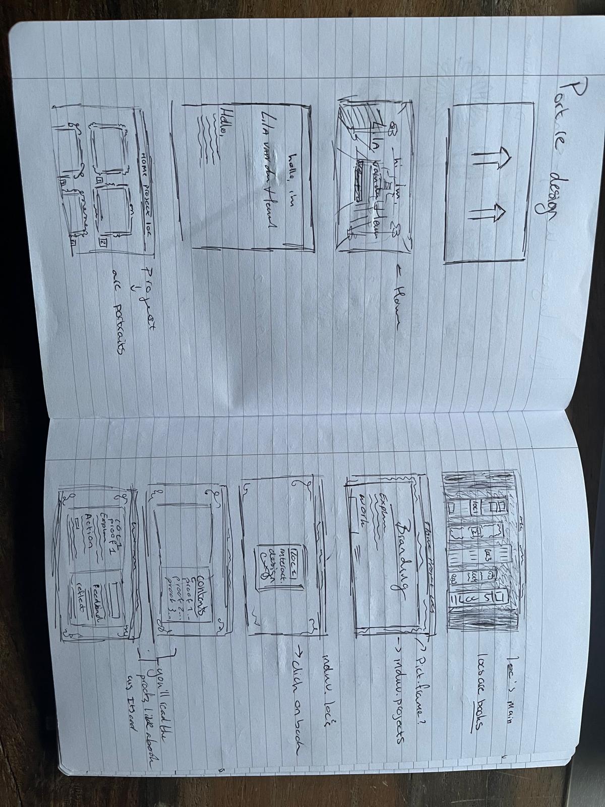
The images above show the first sketches I created before I started using Figma.
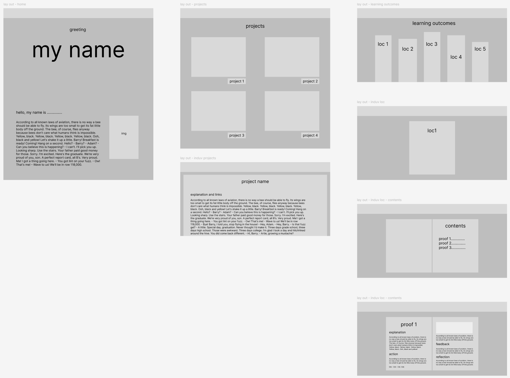
The image above shows a low-quality wireframe I made before I started experimenting with the website's look.
The first version of my design
Here is the first version of my design.
After creating this version, I realized it lacked a cohesive theme. I turned to Pinterest for more ideas and searched for websites with a similar wizard aesthetic. Aside from the Harry Potter website, such sites were rare. Using this research, I began developing a new prototype.
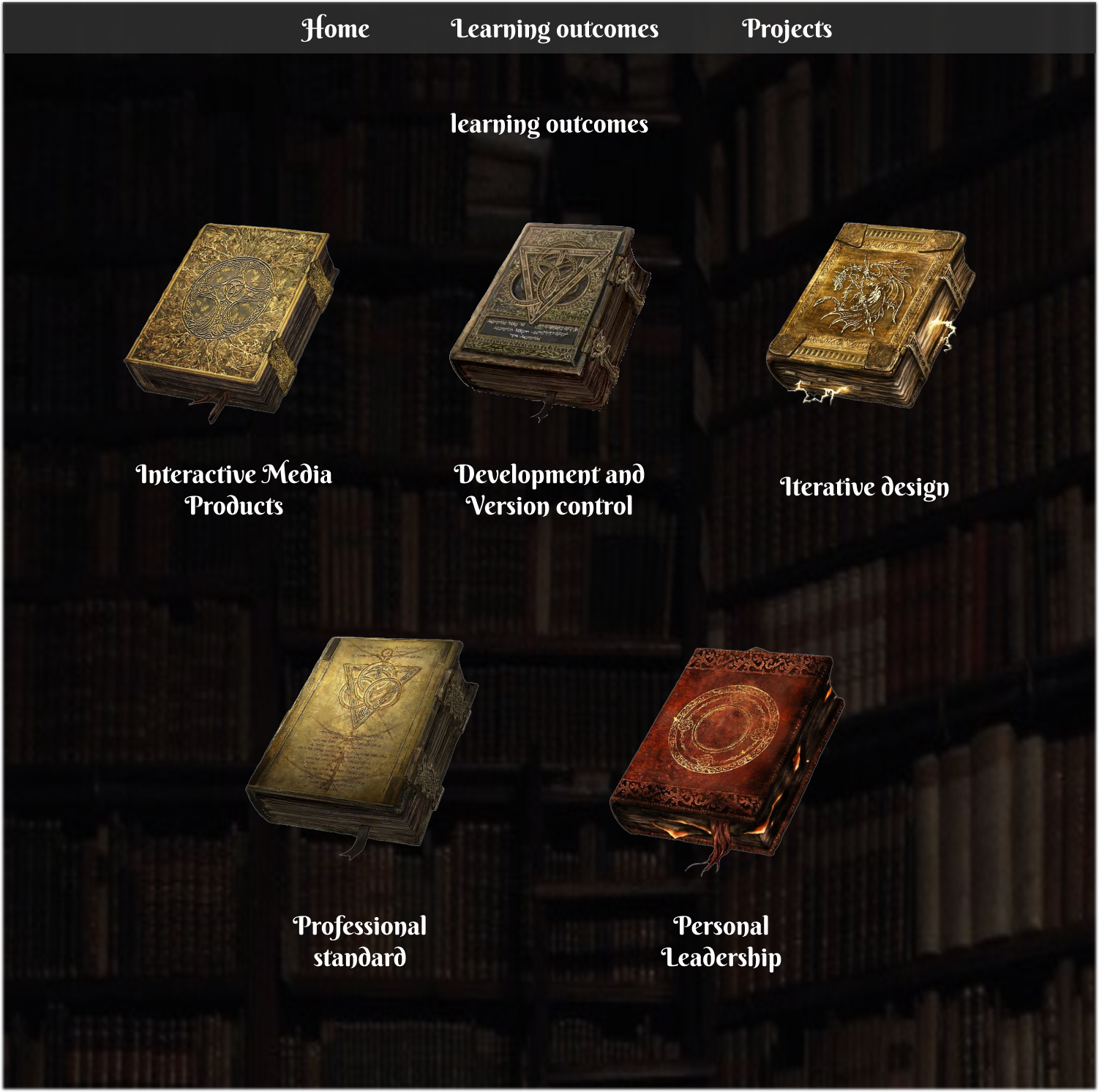
The first version of my prototype
Here is the first real prototype I made.
I presented this portfolio design to the teacher and received positive feedback on the concept. I also received some other feedback:
The main focus should be on effectively displaying the documentation, especially on the project page, rather than prioritizing aesthetic details.
Key suggestions for improvement:
- Use a simpler font for the menu to improve readability.
- Add actual images for the previous projects to experiment with blending colors into the site's theme, like black-and-white or color overlays, with hover effects showing the original colors.
- Add a golden border to buttons for better visibility and consider making the "Discover" button a door to align with the theme.
- For learning outcomes in book form, enhance text integration by adjusting colors, and adding inner shadows, layers, or grainy filters for a more realistic look.
In summary, focus on showcasing documentation first, then refine the design with these suggestions.
From this feedback, I went and changed the learning outcome page text, the project pages, and the menu, and I added pictures to the previous projects.
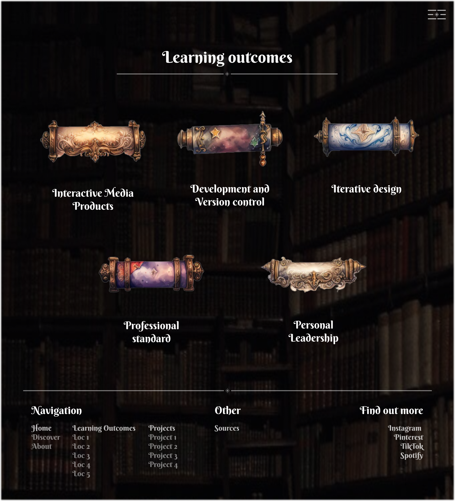
The second version of my prototype
Here is the second prototype I made.
In this prototype, you can see the changes I made from the feedback above. The main change from the previous prototype is that I switched the learning outcome design and the project design.
The learning outcome page now has the scrolls, and the project page now has the books.
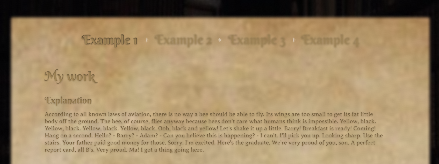
Before and after of 'the learning outcomes page'
In the below, you can see how the content of the learning outcomes would be displayed. I wasn't quite content with the navigation between the examples. I made a different version but left it for later to change.
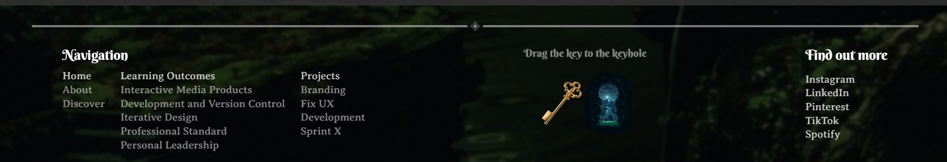
Footer
The other thing I changed in this prototype is that I added a footer.
After making this prototype I tested the navigation with my mother to make sure the navigation was clear. It turned out that it wasn't. I also thought this after thinking about this design some more. So, I decided to make yet another version.
The final version of my prototype
Here is the final version of my prototype
Below you will find the main changes I made from the last version to this version.
The home page
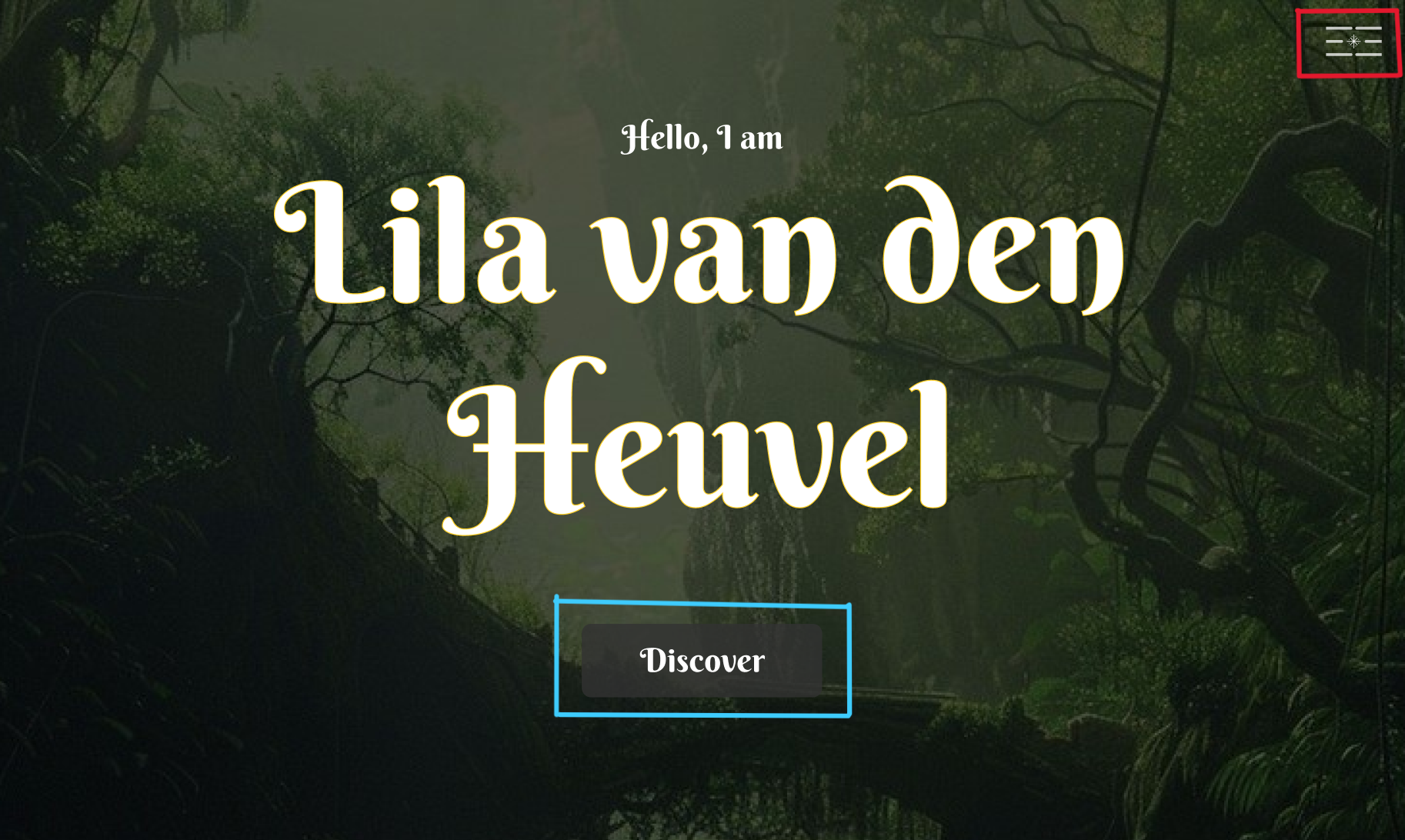
The first image shows the previous prototype, and the second displays the final version. Key changes include:
- Header (red): Redesigned for smoother, faster, and more intuitive navigation, with an improved appearance.
- Discover Button (blue): Updated to include symbols, integrating them into the design.
- Wand Button (yellow): Added a wand icon, also used on project pages, which scrolls to the "About Me" section.
The discover page
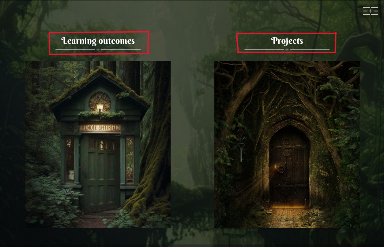
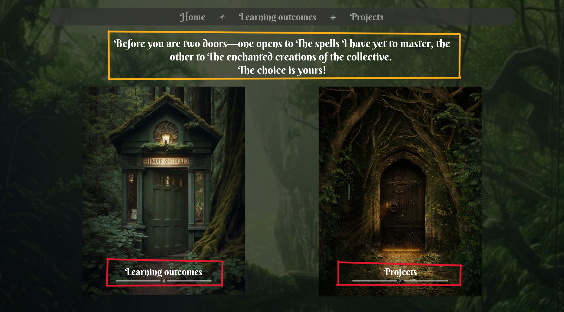
In red, the door titles were moved to the bottom to draw more attention to the doors, serving as subtle clarification since the doors themselves are clickable.
In yellow, thematic text was added to the Discover page to enhance the experience, written in a wizard-like tone to further develop the theme.
Once again I showed my prototype to my teacher. The overall feedback I received was positive.
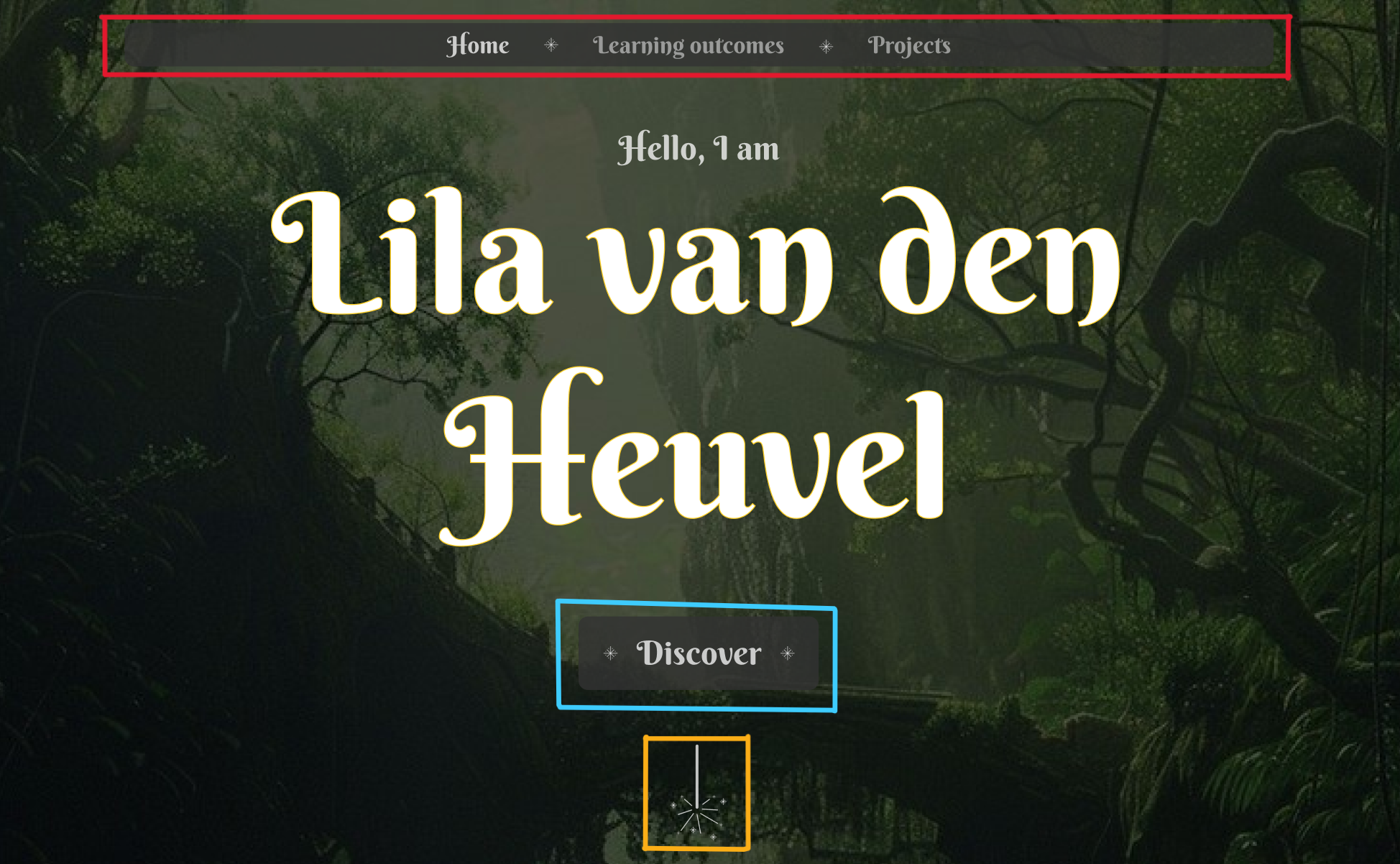
The main feedback I received was that I could add a yellow glow to the header to make it stand out more because, on the home page, if you scroll down, it is very hard to see what the header is and what the 'about me' section is. So that's what I did.
Before and After
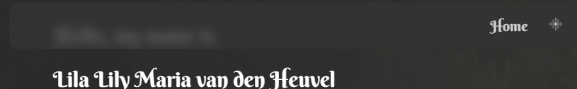
The difference is subtle, but it makes the header much more visible.
While coding I mostly copied the prototype. I did however make some small changes here and there. Here are some of the main changes.
Landing section text - home page
In the images below you can first see the prototype version and secondly the website version.
I removed the border and made an actual glow effect. I added this glow because it gives more depth to the view and makes it less flat. it also helps bring a more magical aesthetic to the website. I added this glow to a few other elements on my website.
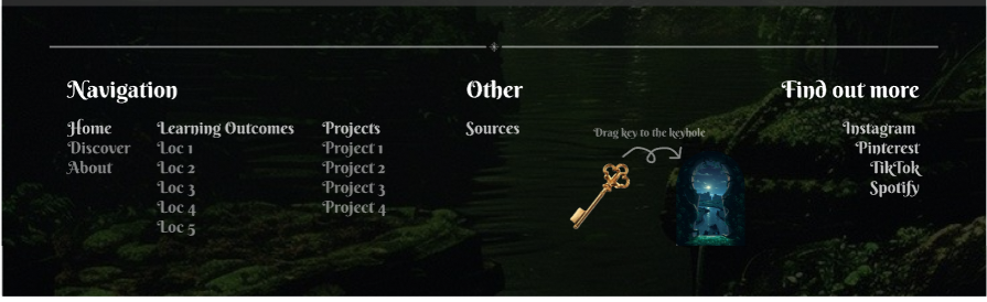
Footer
In the images below you can first see the prototype version of the footer and secondly the website version.

I switched to a simpler font for the secondary text because it's easier to read at smaller sizes, and several teachers preferred it this way.
Individual learning outcome examples
In the images below you can first see the prototype version of the footer and secondly the website version.
The text is slightly darker for the chosen example and therefore easier to read and the examples look completely different. Instead of having a weird blur effect and being in the center I left-aligned them and gave the selected example a slightly darker color than the unselected one. This makes them easier to read and it also makes it easier to identify which one of the examples you are on. I also used a different paper background, one that is more neutral.
Reflection
Reflecting on this process I feel like I did well. Because I had the freedom to create anything I wanted I could choose something I find interesting and that also made the whole process feel not like a burden but just like a fun project. I enjoyed creating this website and making little adjustments that made the website more one whole. I also got a lot of feedback from teachers and people who said they really liked my theme and the vibe of my portfolio so that was also motivating.
I also feel like I asked for a good amount of feedback. The feedback that I asked really helped and improved my website. More feedback is naturally always better so I could have asked for more but overall I'm pretty satisfied with how this went and what I created.
In the future, I hope to make more projects like this and I will continue asking for feedback.
See full documentation here: FULL DOCUMENTATION