
(Portfolio)
Explanation
You present the successive iterations of your creative process, and the connections between them, of your methodically substantiated, iterative design and development process.
In this example of the learning outcome, Creative iterations, I will show the iterations I made for my personal portfolio.
Action
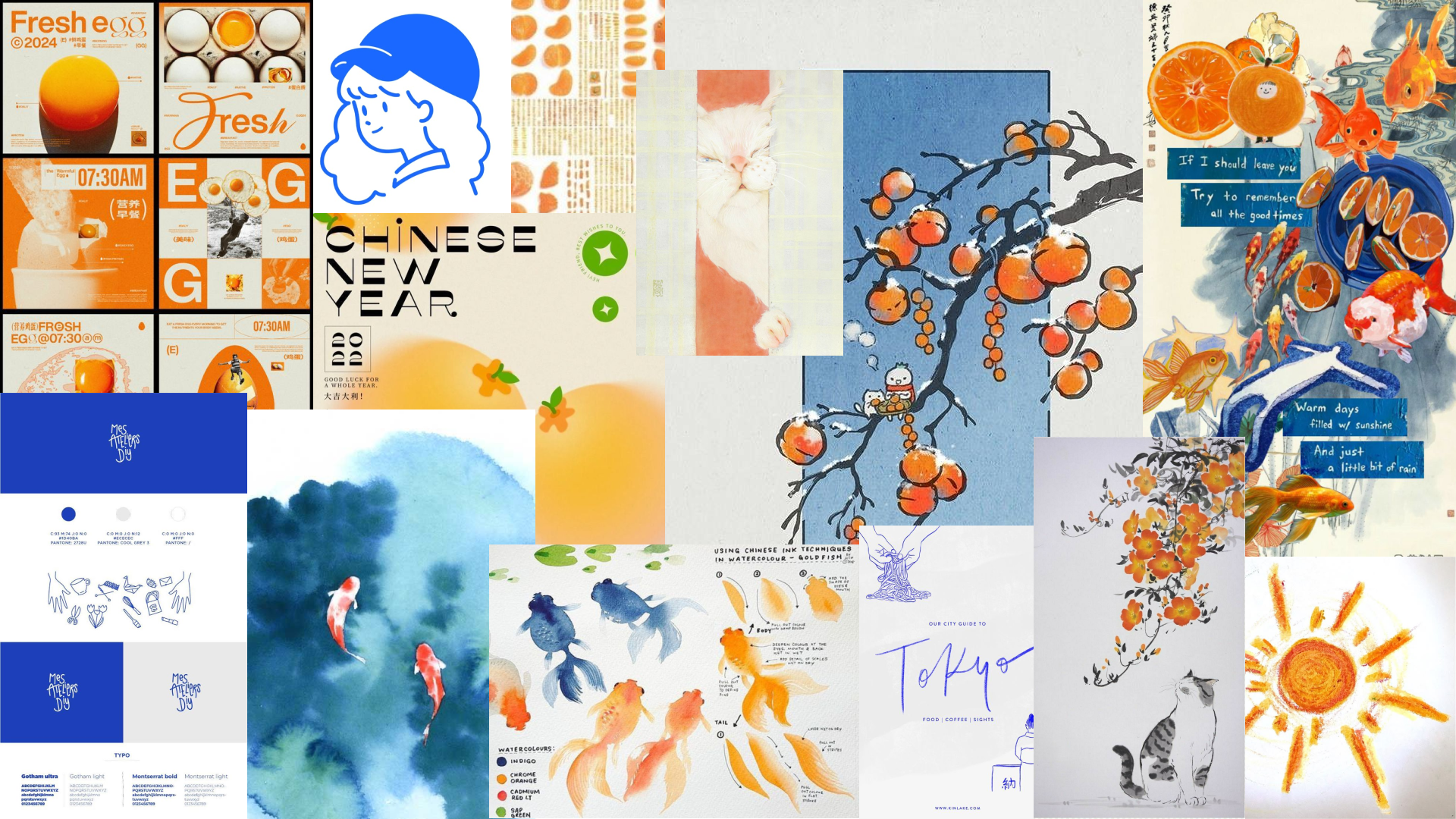
When I started thinking about how I wanted my portfolio to look, I thought it would be fun to make it in the concept/aesthetic of one of my Pinterest boards. So, I made a mood board of this board.
After making wireframes, I wasn't sure if the layouts worked for my chosen aesthetic, so I started making some layout iterations for the landing page/home page.
In the video above, you can see the first iterations I made on the home page. After receiving feedback, I was not really satisfied with what I had come up with. So, I went in a different direction.
In the video above, you can see I made some different orange versions. This time, I tried a few different layouts and imagery styles.

In the image above, you can see the version I liked most.
I also asked for feedback on these iterations.
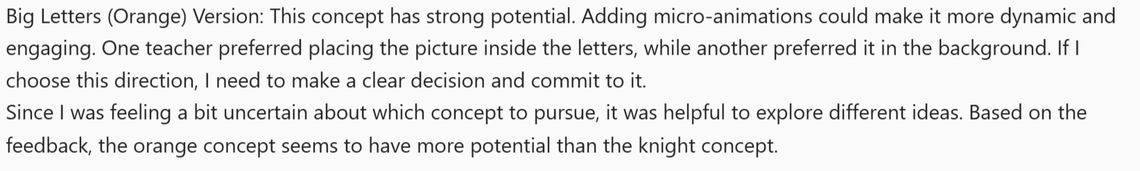
This concept had more potential than the fish version, and I also just liked this version more. So I continued iterating on this version.
I also had/made a Pinterest board for this concept.
In the video above, you can see the new versions of the home page I made based on the previous version.
After iterating more on this design and creating the different pages, I created my final prototype.
I got feedback on this prototype.
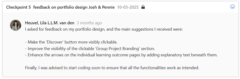
The feedback above states some improvement points. Two points I did not immediately implement, but the last one, “improve the learning outcome arrow navigation,” I did implement.
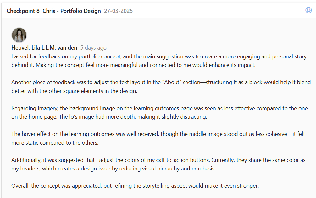
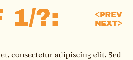
This was kind of a challenge because I had been trying different things that did not really work and that I didn't like. So, after this feedback saying I should add some explanatory text, I tried out some new things.

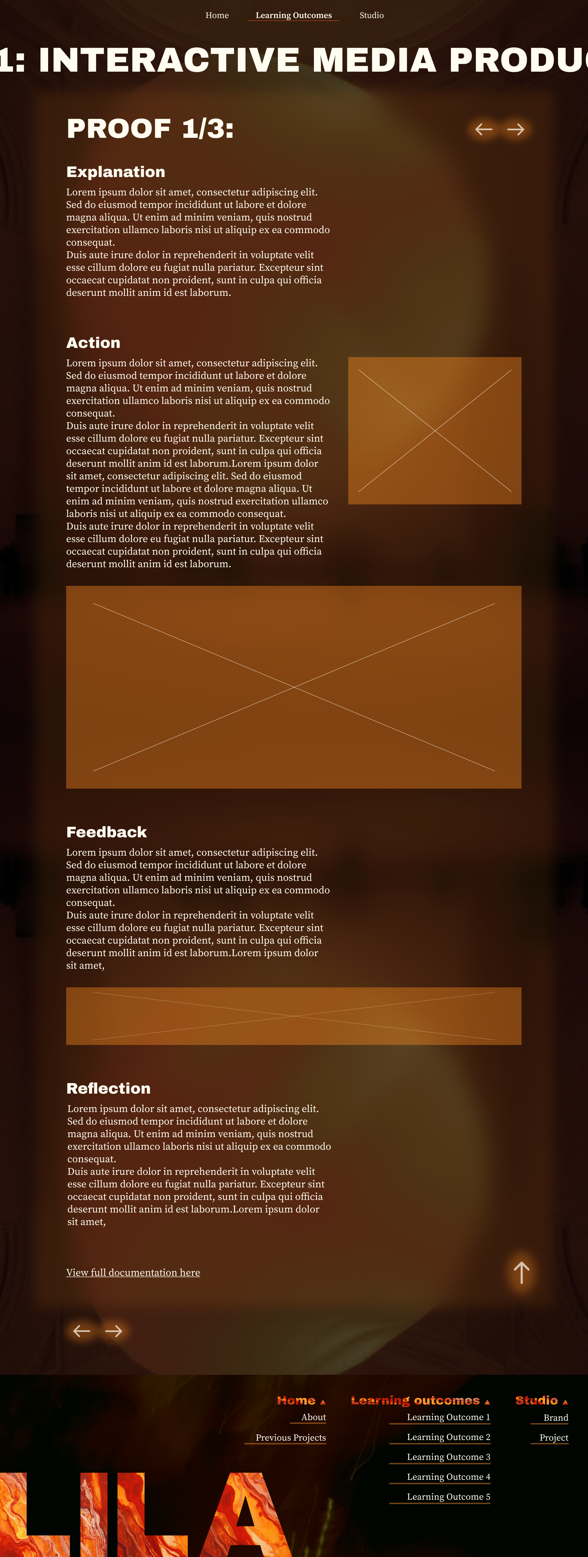
In the image above, you can see the prototype version. The problem was that it wasn't really clear what the arrows did, and they didn't match the rest of the design.
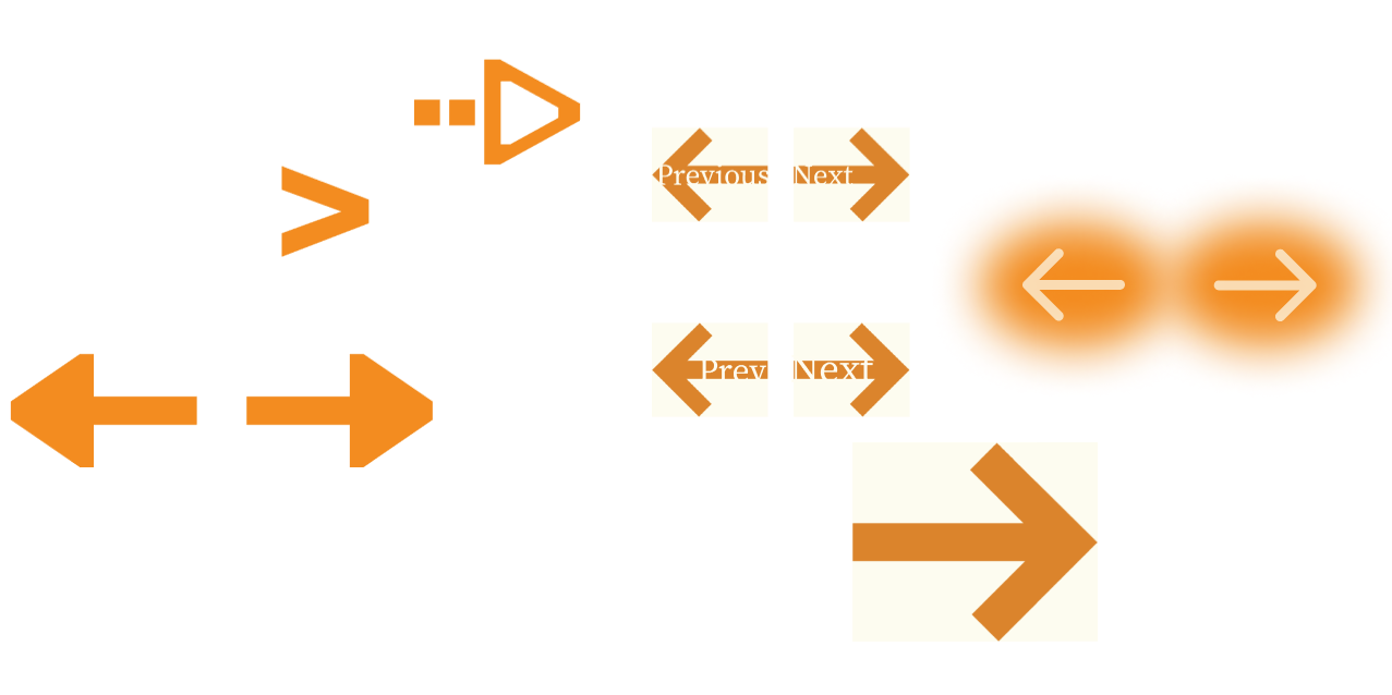
I made some bolder arrows, thinking that would fix the problem. Then I made some bold arrows with text in them, but the text was barely visible. All these attempts did solve my problems until…
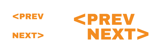
I thought of this combination. Although it is very simple and straightforward, it fits well with the rest of the design because it has one of the main fonts and because it is also block-shaped, just like the images and the elements throughout the design. I was very content with this final version of the learning outcome navigation.
I also received the feedback that I should start coding to see if everything I want to make is possible. Before I started this, I wanted to refine the individual learning outcome design a bit more because I was just not satisfied with it.
In the image above, you can see my starting point for redesigning the new learning outcome page.
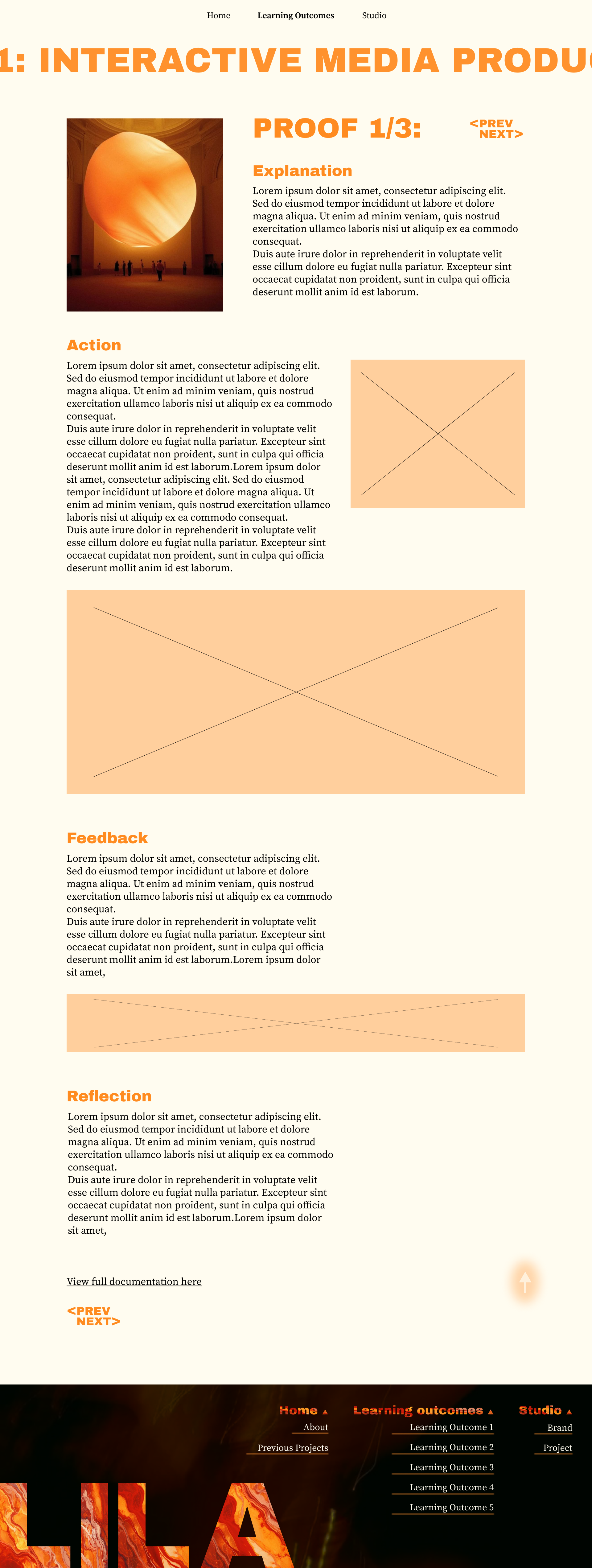
And in this image, you can see the last version of the individual learning outcome design I made. I was satisfied with this version and started coding my design.
After translating most of my design into code, I asked for feedback again.
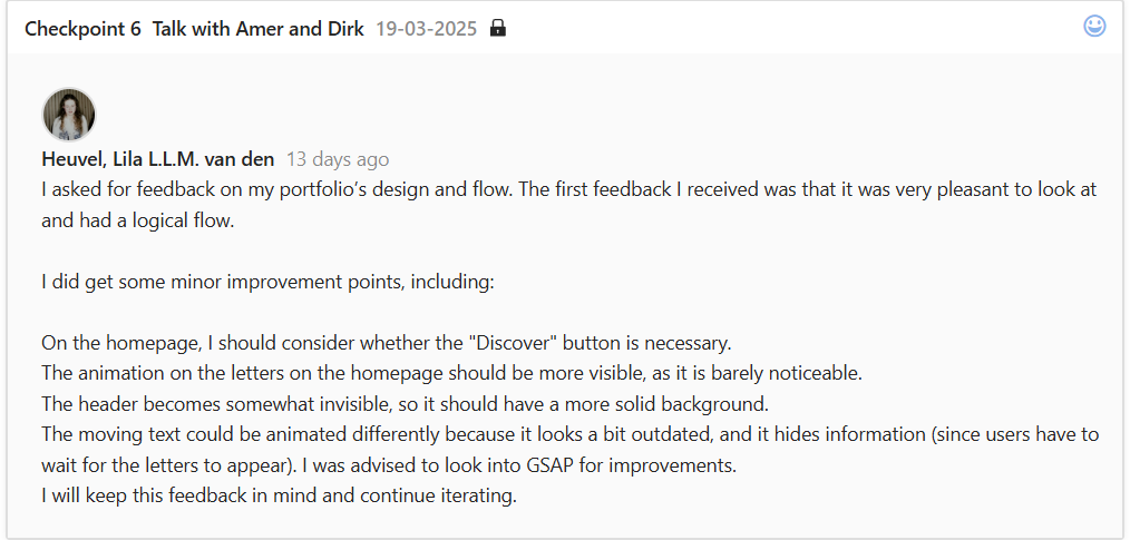
The feedback I received on the flow of the whole website was nice to hear.
The design improvements felt logical to me. The first feedback point about the Discover button on the home page made me realize that I didn't need that button to begin with. It also got rid of the problem addressed in previous feedback about making it clearer that it was clickable. So I just removed it.
The second point of feedback was something I was also thinking about, but was not that high on my to-do list yet, seeing as it is a nice-to-have feature.
Thirdly, for the header, I just made the background blur a lot more intense, which fixed the problem in my opinion, but I still have to test this to validate my opinion.
After continuing to code my website, I asked for feedback again.
The point I immediately tried to tackle from this feedback was the point about my CTA's being the same color as my headers on the individual learning outcome pages. I completely forgot about this very important design rule, but I did not want to deviate from my chosen colors that much. So, I used a darker shade of my main color as the CTA color.
In the image above, you can see how it originally looked.
In this image, above, you can see the new color of the CTA.
After applying this change, I asked for feedback again and got told that the CTA's were now not the most noticeable thing on the page, because the headers were. However, this was okay because at least the CTA has a different color now, making it clearer that it's another element.
Reflection
Reflecting on making this portfolio, I feel like I did well. I iterated, asked for feedback, and implemented most of the feedback. Looking at the given cheat sheet, I think I showed clear starting points, I gave reasons for most of my iterations, and I showed some before-and-after's. The 'validations of iterations' part is also touched, and I'm not sure how to show iterations in other areas for this learning outcome example, but in the examples that will follow, I will ensure this point will also be touched on.
Besides the 'school points,' I also enjoyed iterating on my portfolio, less so in the beginning, but after I committed to the final concept, I did enjoy it.
View full documentation here