(Studio Branding)
Explanation
You present the successive iterations of your creative process, and the connections between them, of your methodically substantiated, iterative design and development process.
In this example of the learning outcome Creative Iterations, I will be showing my iterations for the studio's branding.
Action
Branding studio concept
When we as a group got the assignment to make a branding and think of a group name, I started making some different concepts and potential names. I came up with these names with ChatGPT and my brain.
A name/concept I came up with and liked was Negative Space.
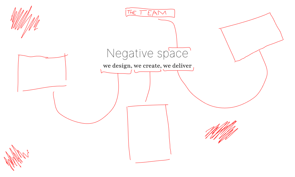


I liked how the red thin line drawing style looked playful, yet chic and creative. In my mind, it was a good name for a design-oriented studio because negative space is a design term, and the name ends with ACE. I thought this was a smart way to refer to our team.
Then, because space sounds a bit like spade, I thought it would be nice to have a spade as the group symbol.
In the second picture, you can see that instead of the letter A, there is now an upside-down spade. I placed the spade upside down because I thought about 'negative' and therefore I placed the spade upside down. I, however, thought that this looked a bit messy and not really visible. I also thought that it didn't look completely clear that the spade was an A. So I made another iteration.
The last picture was the final version of this concept I made. I moved the spade to stand in between the words because I thought that made the words clear and readable while still incorporating the spade.
This was the concept I liked most out of the ones I made. Sadly, it was not chosen as the final concept.
Logos
The way our group went about creating the logos was that all of us would make some on our own and then we would choose one of them. The theme of the logo was goblins because of the name Draft Goblins.
So I first started looking for some inspiration.
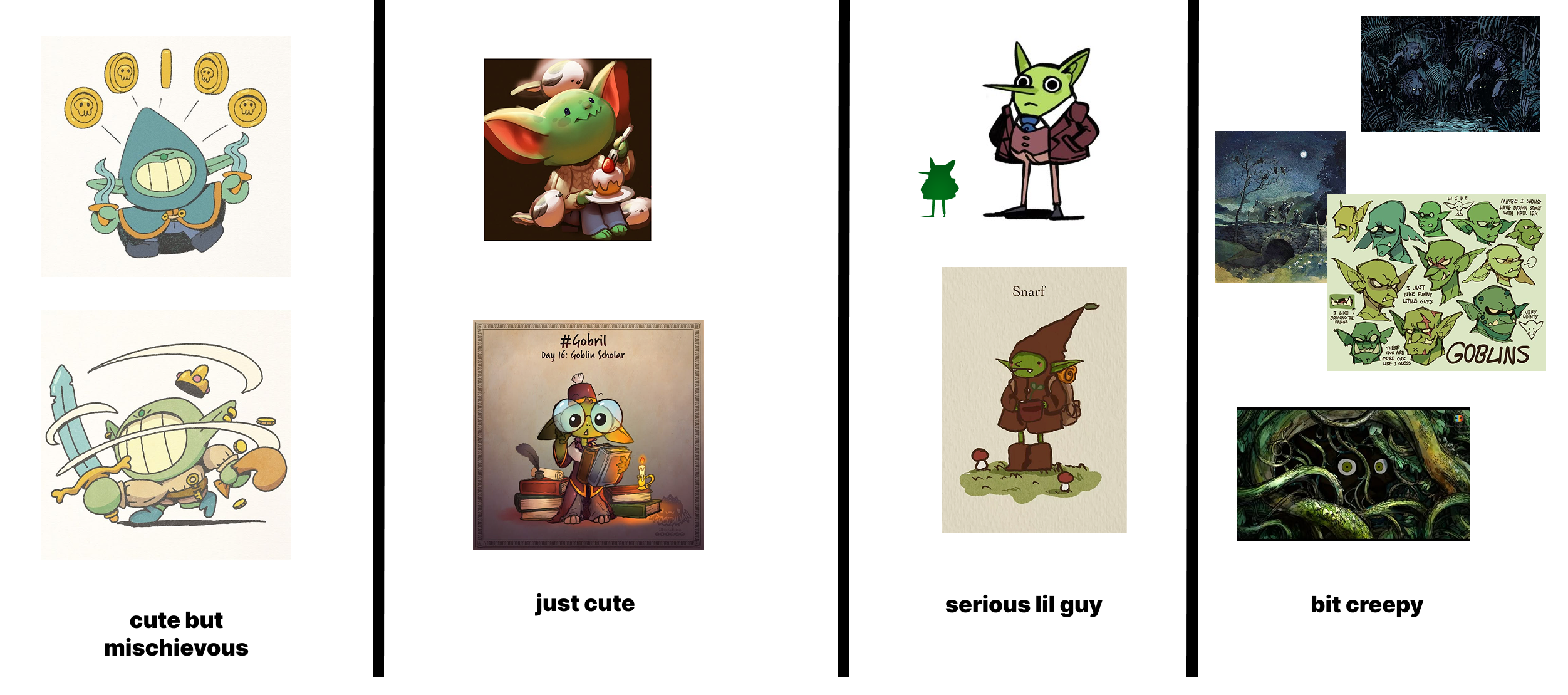
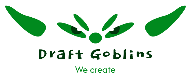
After I found some goblins that I liked, I made sketches.
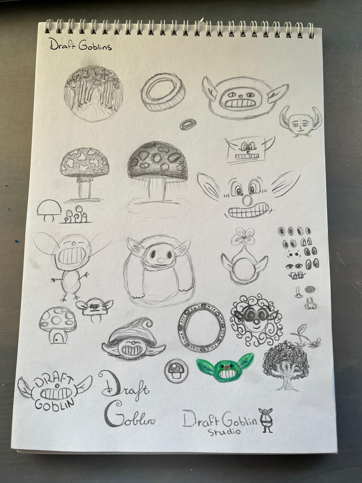
After making the sketches, I looked into different fonts.
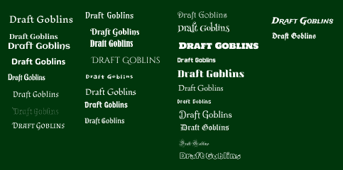
Then, I started to make some different logo designs with different fonts.
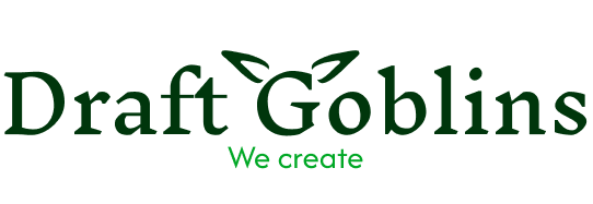
In the last image, you can see the logo I ended up with. I got feedback on this logo, and the feedback was that it looked like a plant. That was not the vibe I was going for, so I decided to iterate further on another logo I made.
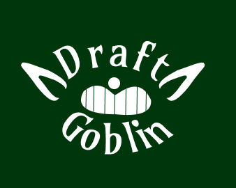
In the image above, you can see the first logo I made from a sketch.
In the video above, you can see the iterations I made for the logo we ended up choosing.
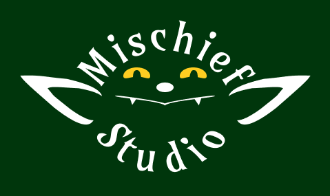
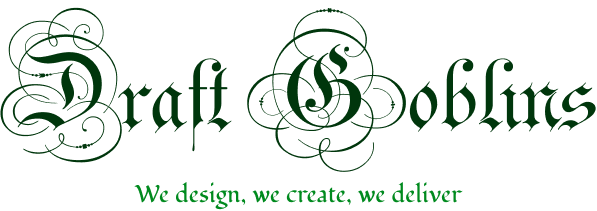
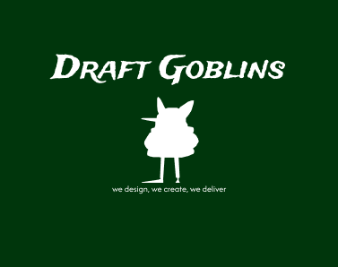
In the picture above, you can see our final logo. The feedback we received on this logo was that it was a good logo. It could potentially use some slight adjustments because the lines of the goblin's face were quite thin. Additionally, the letters could be all lowercase, so the flow of the circle is smoother. The teacher who gave the feedback said we could do this during the entire project.

I did not iterate further because our branding phase was finished, and I was satisfied enough with this logo.
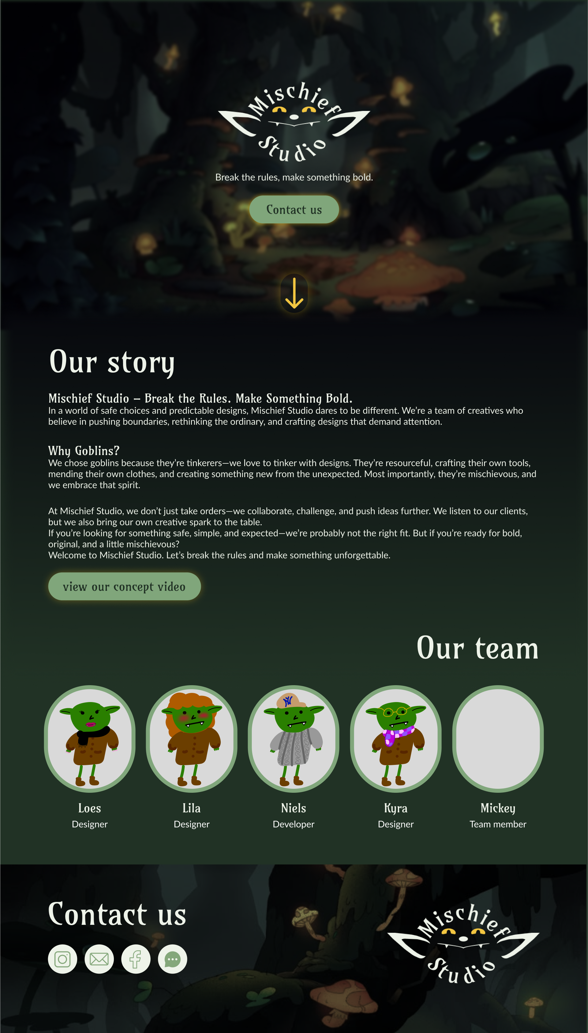
Web design
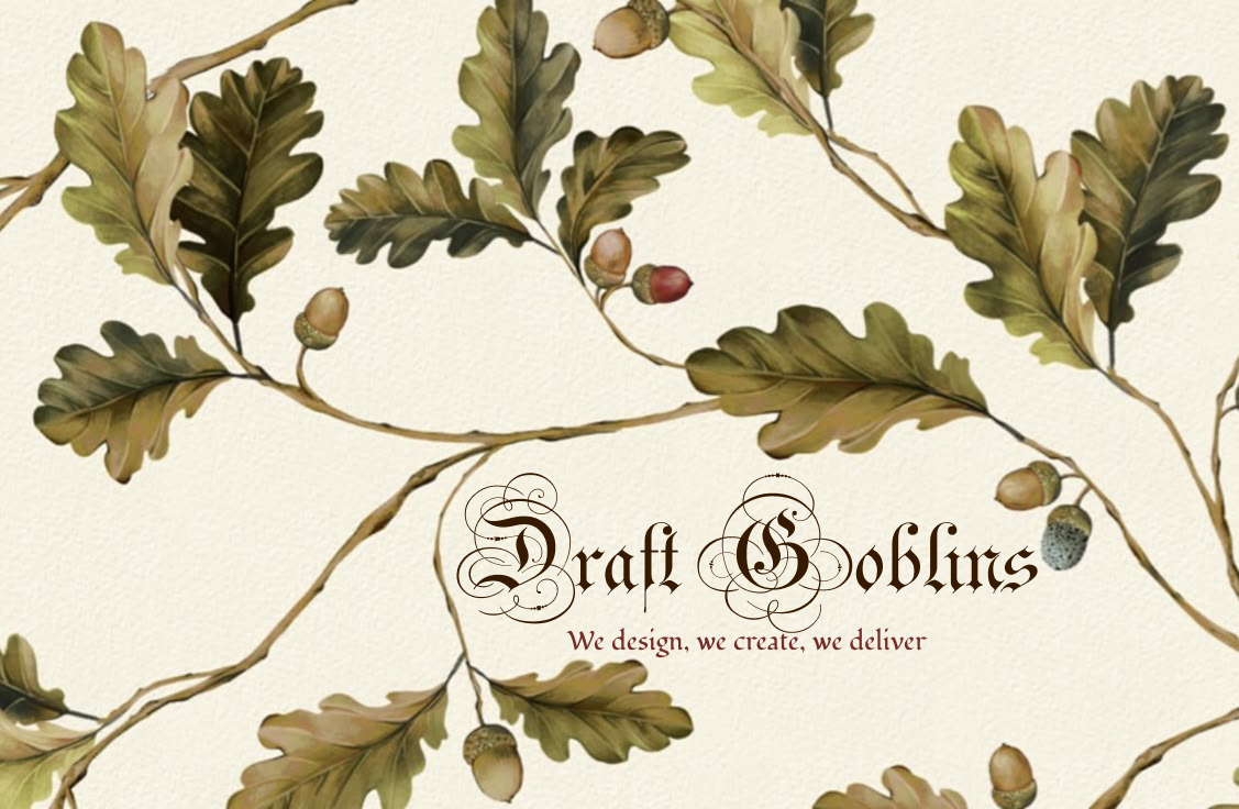
We also decided to make a web design for the branding to give a better view of the brand.
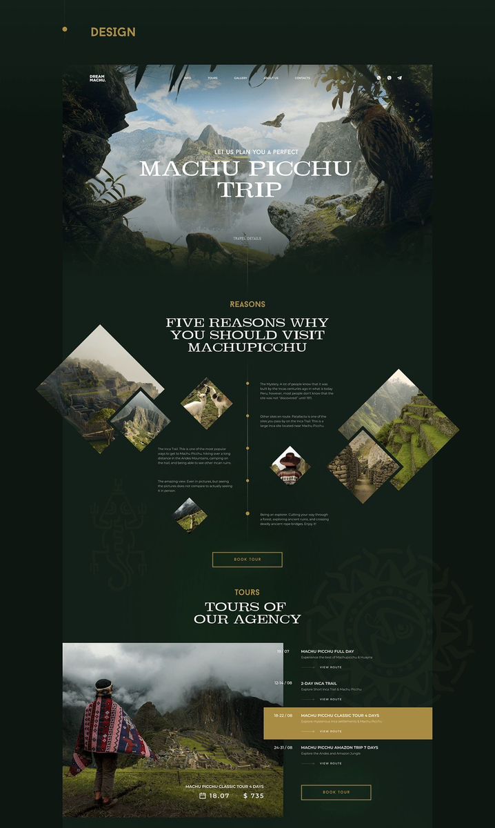
In the image above, you can see the inspiration I used. I found this design on Dribbble and thought it was a good fit because of the similar colors, and I liked the layout.
In the video above, you can see the iterations I made for the web design.
In the picture above, you can see the second-to-last version I made for the web design. We asked for feedback on this design.
We asked for feedback from four different teachers, and the feedback was very different. From two teachers, we got feedback that the concept was cool and interesting, and that the logo fitted our concept, but from the other teachers, we got feedback that everything we did was not very good. So, we decided to think about it, and we ended up not incorporating the second feedback.
The last version of the web design was made by everybody in the group. Here is the final version.
The main thing I did for this was to remove the contact button from the landing section, make sure the spacing was correct between all the elements, change the “Why Goblins?” section, and decide on some of the smaller design choices.
Concept video
I also made a video to further convey the concept of our brand.
First, I just made an audio with subtitles.
I made this 'video' using CapCut. I used this software because I had previous experience using it. I also found that I could add a storytelling voice to the subtitles.
I did find the black background boring, so I decided to add some pictures in the background so that the concept would be visually conveyed.
Reflection
Looking back on the process of making this branding, I feel like it went okay. I enjoyed making the different versions of the logos and iterating on them. I also really liked our theme, because I enjoy fantasy. Overall, I think it went well, even though I was the only one who was there the whole time, because there were quite a few absences in the group during this phase.
In the future, I think I wouldn't do a lot of things differently. One thing I would do differently is make better rules about absences and how to continue if people are sick, because this was a hiccup we had.
View full documentation here