
(Portfolio)
Explanation
You create engaging concepts and translate them into interactive validated media products by applying user-centered design principles, visual design techniques and by exploring emerging trends and developments in media, design and technologies.
In this example of the learning outcome CDDIMP, I will be showing examples of my portfolio.
Action
Target audience
Definition: The primary target audience for my portfolio is my teachers, as the portfolio is meant to showcase my progress and work throughout the semester.
Validation: To ensure my portfolio meets the needs of my target audience, I actively sought feedback from multiple teachers throughout the design and development process. Their insights helped refine my design choices and usability.
Concept
The concept for my portfolio is a warm orange, mostly pictures from Pinterest. I got the idea for this concept from a picture I took in a store.

In the picture above, you can see said picture. It was taken in an interior store called Oogenlust in Eersel. I really like this store's interior design, it's very peaceful and inspirational. I also like the color orange because it reminds me of the sun, and orange-tinted sunglasses make the world much happier. That's why I ended up choosing this concept.
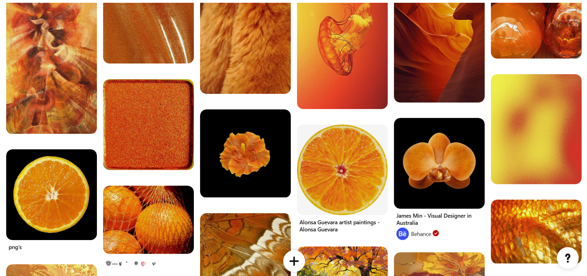
In the picture above, you can see my Pinterest mood board. This is basically my actual mood board.
Prototypes
In the picture above and link, you can see the first low-functionality prototype I made for my portfolio in Figma. You can only click on the pages, and then they change. I made this prototype to see if the concept came across on the other pages as well.
I asked my teacher for feedback on this.
The main thing I learned from this feedback was that I should start imagining what the animations should look like. Besides this, it looked promising.
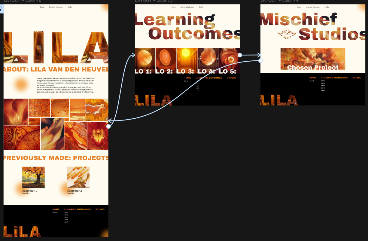
After iterating a bit more and making some learning outcome pages.
I again asked for feedback on this design.
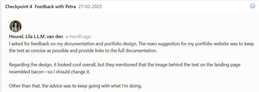
In the feedback above, you can see that I got the feedback that the image in the letters looked like bacon. In the image above, you can see that I have already changed this.
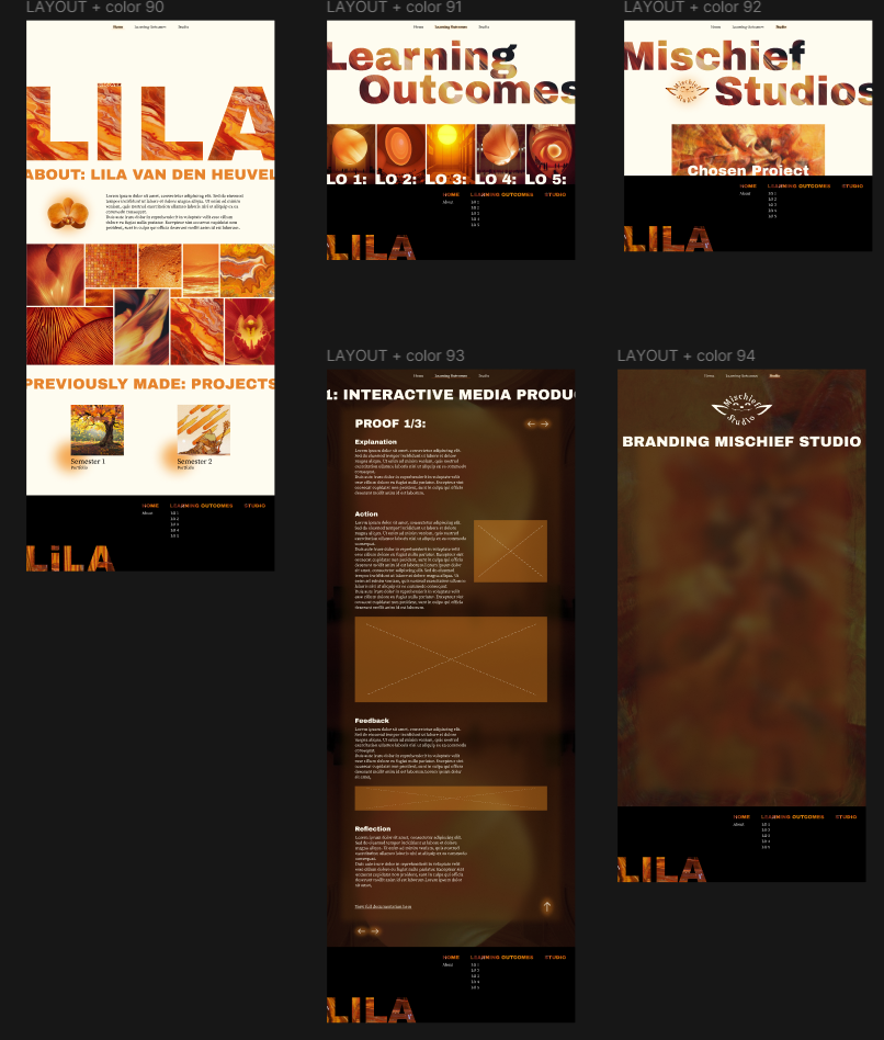
After making more iterations, I made a final prototype and started coding.
I started coding early because I was advised to, and it helped me explore more development techniques, including responsive design and interactive animations, to enhance usability.
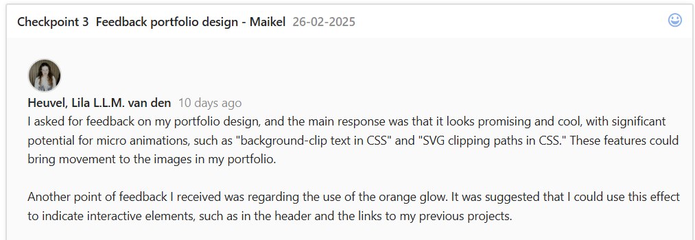
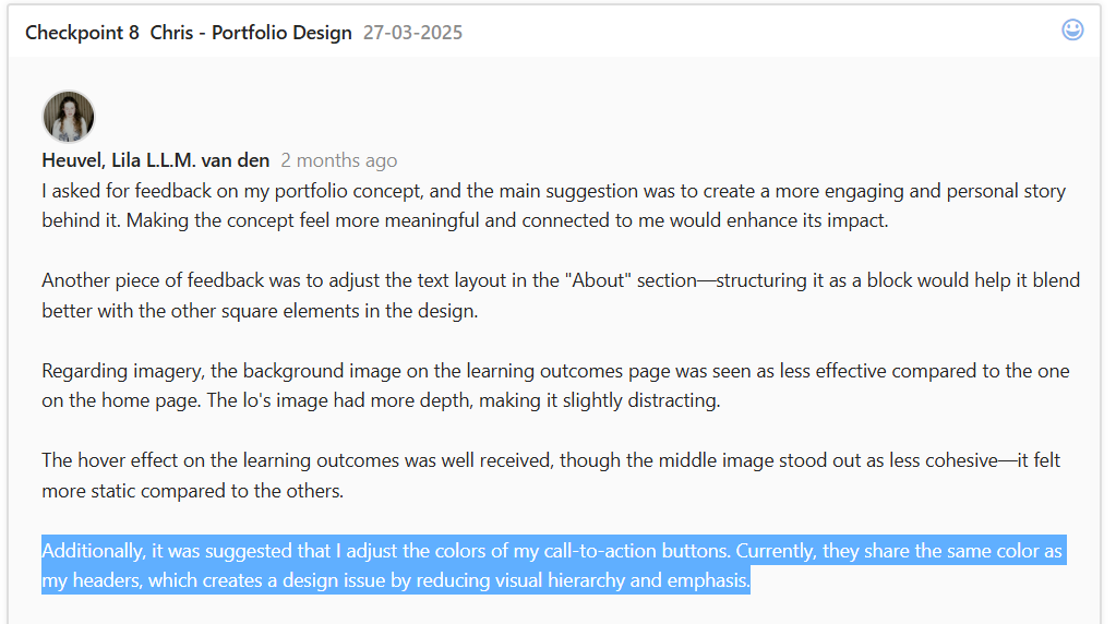
I then asked for feedback again.
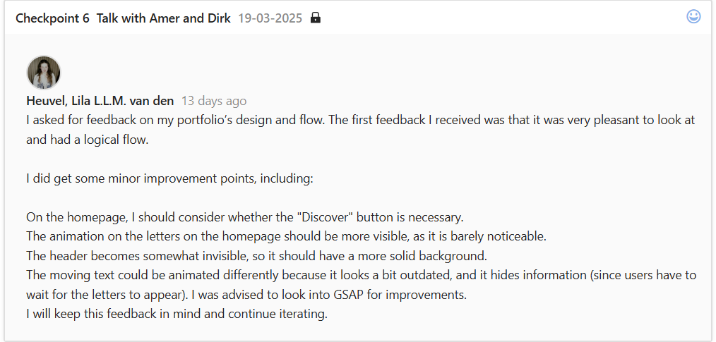
In the image above, you can see that the feedback I received on the design and flow was very positive, confirming that the (almost) final design was user-friendly and aligned with my target audience, but some minor improvements were suggested.
You can find further iterations in learning outcome 3, example 1.
Interactive product
For my final interactive product, I have my portfolio itself.
Design thinking/user experience
Text width:
Before
After
This way, the text is much easier to read. The distance your eyes travel gets shorter, making it easier to track where you are in the text. This is especially important to me because of my dyslexia; I tend to lose where I am in a big text often. Big texts can also feel overwhelming, so narrower text combats that issue, too. Besides these points, it is also more visually appealing; this is why magazines and newspapers have narrower text.
CTA'S
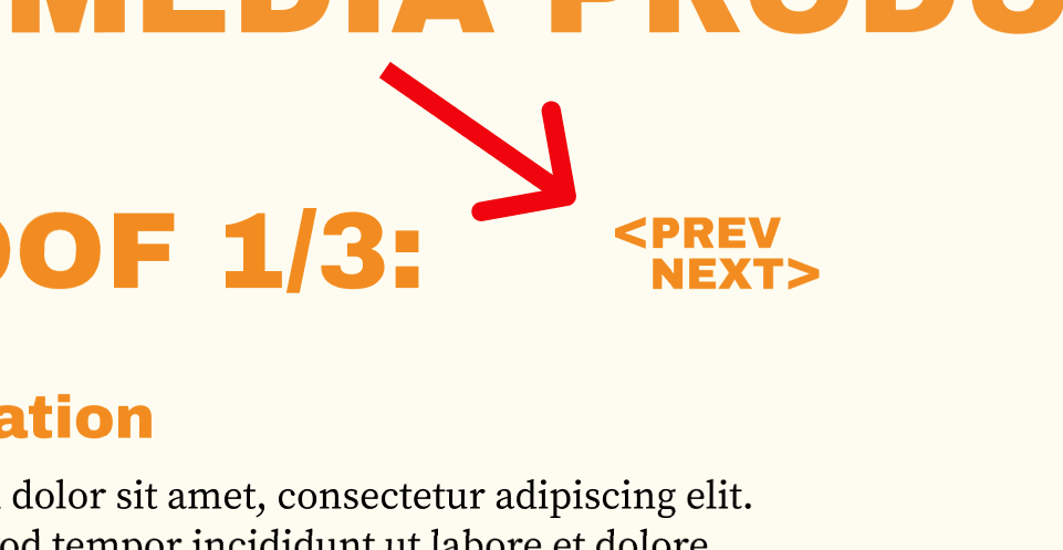
Navigation between learning outcome examples:
Before
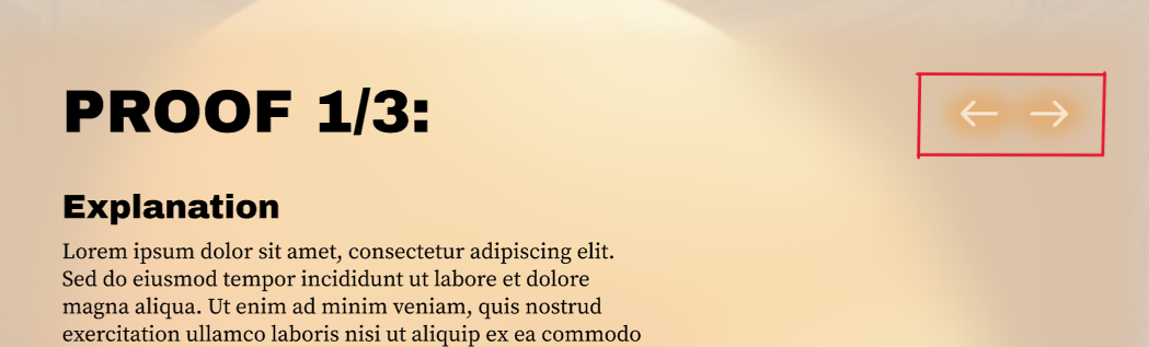
After
The full iterations can be found in learning outcome 3, example 1.
I made this change after asking my teachers for feedback, as I was not fully satisfied with it.
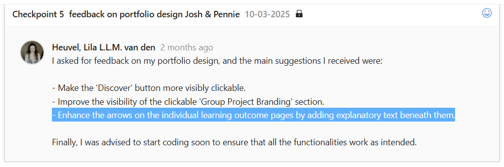
The first feedback I got was to make them more visible. From this feedback, I made the new design, but it was in the same color as the title texts. So after I asked for feedback a second time, I got told that CTA's should have different colors because then it's clearer for the user what is clickable and what is static.
So, after implementing these changes, I felt much happier with the design of the navigation, because now it was backed up by feedback.
Reflection
Reflecting on the process of creating my portfolio, I feel that it went quite well. I actively sought feedback from my teachers, making sure to get multiple perspectives. This feedback was valuable, as it gave me a lot to think about and helped improve my design and user flow. For example, one important reminder was the need to use different colors for CTAs, which I had completely overlooked. This is an important user-centered design principle. I might not have caught this detail without feedback, but luckily, the issue was resolved afterward.
However, I recognize that my process of transitioning from wireframes to the final design could have been stronger. While I created wireframes for my first concept, I ended up disregarding them entirely. When I moved on to my second concept, I skipped low-fidelity designs and went straight to high-fidelity because I already had a strong vision for colors and imagery. This was partly due to excitement about the visuals, but also because I slightly forgot about the structured design process. This was one of my failures, but I was still able to test the concept effectively before coding.
Although this approach worked out in the end and I didn't feel like I missed having wireframes or low-fi designs, I acknowledge the importance of following a structured process. In the future, I will make a conscious effort to incorporate all design phases to ensure a more refined and efficient workflow.
View full documentation here